Top products from r/Calligraphy
We found 93 product mentions on r/Calligraphy. We ranked the 218 resulting products by number of redditors who mentioned them. Here are the top 20.
1. Spencerian Penmanship (Theory Book plus five copybooks)
Sentiment score: 5
Number of reviews: 8
Includes 5 workbooks and 1 theory book (52 pp.)Great for students and adultsPaperbackReprinted in the USA
 Show Reddit reviews
2. Mastering Copperplate Calligraphy: A Step-by-Step Manual (Lettering, Calligraphy, Typography)
Sentiment score: 5
Number of reviews: 7
Mastering Copperplate Calligraphy A Step by Step Manual
 Show Reddit reviews
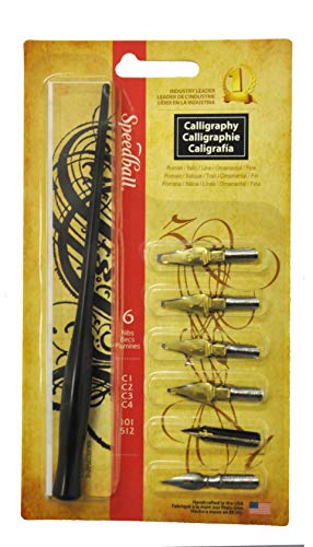
3. Speedball Calligraphy Pen Set
Sentiment score: 4
Number of reviews: 6
GREAT FOR BEGINNERS - Ideal set that features a variety of nibs for learning the arts of calligraphy, lettering and embellishmentFOR CALLIGRAPHY, SCRIPTS & EMBELLISHING - Excellent for Roman text, Italic alphabets, ornamental work or fine letteringQUALITY, HAND-CRAFTED NIBS - Contains (4) C Style Pe...
 Show Reddit reviews
4. The Calligrapher's Bible: 100 Complete Alphabets and How to Draw Them
Sentiment score: 4
Number of reviews: 6
Used Book in Good Condition
 Show Reddit reviews
5. Medieval Calligraphy: Its History and Technique (Lettering, Calligraphy, Typography)
Sentiment score: 5
Number of reviews: 6
 Show Reddit reviews
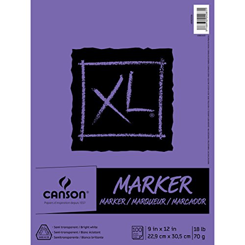
6. Canson XL Series Marker Paper Pad, Semi Translucent for Pen, Pencil or Marker, Fold Over, 18 Pound, 9 x 12 Inch, White, 100 Sheets (400023336)
Sentiment score: 3
Number of reviews: 4
Feature a semi translucent, white paperSuitable for drawing or design from rough sketch to finished formWorks beautifully with pen, pencil, and alcohol or solvent markers (which will not bleed through! )These 9 x 12 inch pads contain 100 sheetsFold over bound, acid free, and 18 pound/70 gramFeature ...
 Show Reddit reviews
7. Speedball Calligraphy No-5 Artists Project Set
Sentiment score: 5
Number of reviews: 4
GREAT FOR A VARIETY OF TECHNIQUES - Use lettering, calligraphy, poster-making, sketching, cartooning and mappingQUALITY HAND-CRAFTED NIBS - Contains (3) of the following: B Style Pen Nibs (B1, B3, B5), C Style Pen Nibs (C0, C2, C4), Pen Points (No. 102 Crow Quill, No. 56, No. 513EF)INCLUDES TWO PEN ...
 Show Reddit reviews
8. Italic Calligraphy and Handwriting: Exercises and Text
Sentiment score: 3
Number of reviews: 4
 Show Reddit reviews
9. Rhodia Black Dot Pad Nº 19, 8.3 x 12.5
Sentiment score: 3
Number of reviews: 4
Dot Pad Black 8. 3 x 12. 5 Notebook
 Show Reddit reviews
10. Modern Calligraphy: Everything You Need to Know to Get Started in Script Calligraphy
Sentiment score: 4
Number of reviews: 4
Modern Calligraphy
 Show Reddit reviews
11. Speedball 003069 The Speedball Textbook 24th Edition - Calligraphy Instruction Book - 120 Pages
Sentiment score: 3
Number of reviews: 4
THE BEST CALLIGRAPHY RESOURCE - For artists and letterers of all ages and skill levelsEDITED BY WELL-KNOWN CALLIGRAPHERS - Featuring the vision of new co-editors, Angela Vangalis and Randall HassonENHANCED CONTENT - Provides readers with instruction and inspiration for techniques and styles ranging...
 Show Reddit reviews
12. Spencerian Copybooks 1-5, Set, without Theory Book (Spencerian Penmanship)
Sentiment score: 4
Number of reviews: 4
 Show Reddit reviews
13. Manuscript MC146 Masterclass Calligraphy Set
Sentiment score: 2
Number of reviews: 3
Includes 4 nibs, 2 pens, 12 ink cartridges and a instruction bookPerfect for beginners and experienced calligraphersStep by step instructions
 Show Reddit reviews
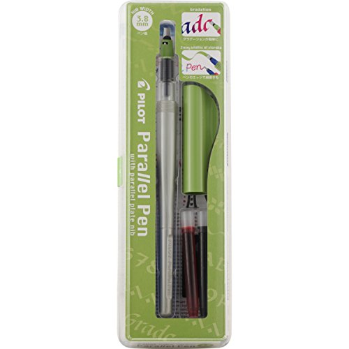
14. PILOT Parallel Calligraphy Pen Set, 3.8mm Nib with Black and Red Ink Cartridges (90052)
Sentiment score: 2
Number of reviews: 3
Pilot Parallel Calligraphy Pen: Pilot's breakthrough nib design features 2 parallel plates & allows for sharp, monoline writing with the narrow edge, & expressive, calligraphic writing with the broad edge.Mix and Match: Refillable with a wide variety of ink colors and available in 4 nib widths: 1.5 ...
 Show Reddit reviews
15. HP Paper Printer Paper 8.5x11 Premium 32 lb 1 Ream 500 Sheets 100 Bright Made in USA FSC Certified Copy Paper Compatible 113100R, White
Sentiment score: 0
Number of reviews: 3
Made in USA - HP Papers is sourced from renewable forest resources and has achieved production with 0% deforestation in North America. See images.Optimized for HP technology - All HP Papers provide premium performance on HP equipment, as well as on all other printer and copier equipment. 100% satisf...
 Show Reddit reviews
16. PILOT Parallel Calligraphy Pen Set, 1.5mm Nib with Black and Red Ink Cartridges (90050)
Sentiment score: 2
Number of reviews: 3
Pilot Parallel Calligraphy Pen: Pilot's breakthrough nib design features 2 parallel plates & allows for sharp, monoline writing with the narrow edge, & expressive, calligraphic writing with the broad edge.Mix and Match: Refillable with a wide variety of ink colors and available in 4 nib widths: 1.5 ...
 Show Reddit reviews
17. William Mitchell Calligraphy Dip Pen Nib Set - Roundhand Selection Box
Sentiment score: 2
Number of reviews: 3
Perspex storage boxPlastic pen holderNibs sizes: 0, 1, 1.5, 2, 2.5, 3, 3.5, 4, 5, 62 ink reservoirs and a magnet
 Show Reddit reviews
18. The Art and Craft of Hand Lettering: Techniques, Projects, Inspiration
Sentiment score: 1
Number of reviews: 2
 Show Reddit reviews
19. Sharpie Calligraphic Water Based Black Marker pack of 12 (40001)
Sentiment score: 1
Number of reviews: 2
Medium chisel-edged tip is ideal for calligraphic needs.Black, water-based ink formula is neutral on acid-free paper and AP certified non-toxic.Bright, vivid color makes a statement on a variety of paper surfaces.Contains 1 pen.3.25 inches long by 1.125 inches wide by 5.875 inches high. 0.299 pounds...
 Show Reddit reviews
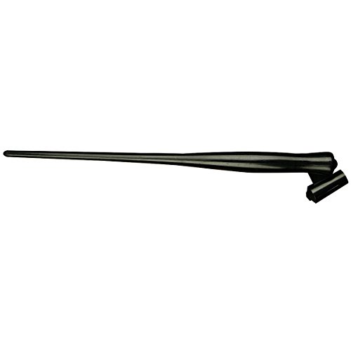
To expound on the 80-90/10-20 part, look at many scripts.
It helps to remember where calligraphy came from. Calligraphy was simply the result of marketing. Back in the day, scribes and nobels were the only ones that could write. So what happened? Well for scribes, what's your most effective marketing tool? "I can write faster and prettier than the guy next to me". And for nobels, why calligraphy? "I can write elegantly, so it demonstrates the fact that I'm a man of high culture and class".
So if you think of Calligraphy as striving towards beauty and efficiency for the sake of marketing, ease of reading, and the ability to not have scripts degrade when other people wrote them, it makes a lot more sense. (monks needed the latter, which is why the gothic styles are among the most restrictive. If you're copying books for hundreds of years, it wouldn't do to have the book of Matthew be totally different looking than the book of genesis)
As it became more developed, it became more artistic and creative as people pushed the boundaries of technology, innovation and knowledge. Much like Gymnastics started out as much more rough and tumble sport, and now almost every gymnastics routine is identical as everyone strives towards a clearly and concretely defined ideal.
Now that we have paper in abundance, and pens that are affordable to anyone (e.g. free), we're entering into a new era. Everyone can write, so therefore writing is optional. It's a funny idea, but that's how it usually is. If everyone can do something, it's not novel, and as things progress the trade is refined and elaborated into an artform, or dropped into disuse.
Farming: Everyone did it. It became not novel, but rather a given. It progressed, then, into an artform. The artform being "how efficiently, and how fast, can I grow things?". Today, this artform is incredibly complex, requiring machinery, vast resources, technology and even PhD's to advance the craft. To practice it, you don't need nearly that amount of resources, but it's still a far cry from saying "hey, I bet if I used a metal hoe instead of a wooden one..."
Writing: Everyone that needed to became able to do it (scribes/learned-men/nobles). It became not novel, but rather a given that you could find a scribe. It then progressed into an artform, being "how efficiently and beautifully can I write this?". Today, everyone knows how to write basically, so the art of writing has reached an equilibrium. It's advanced enough to get the job done, and it needs to go no further. In the art side of it, however, it's continued to advance as people develop better and more advanced technique, technology and equipment for the art. Fountain pens, flexible ones, dip nibs, better inks, better paper, more efficient ways of learning it, etc.
Hand-lettering is simply the in between stage of writing as an art and as a utility, as our technology is so diverse on the Earth in needs and utilization that all crafts and trades are in a constant state of flux across many levels of skill. (We have advanced metal working for CPUs, and we have people who still craft cups and knives out of metal by hand). Hand-lettering could also be seen as the creative expression of the art of writing, much like power-tumbling is the creative expression of gymnastics, or gardening/landscaping is the creative expression of farming.
Edit: motherofgod.gif
I wrote way more than I intended to... Sorry.
Well, I am still a newbie, but here's some advice just from what I have tried. Please correct me if I'm wrong! Also, I do broad-nib stuff, so if you're doing pointed things I can only repeat what I've read here.
I'm just assuming that you don't have any local art stores that are more convenient than ordering online, but if you can go somewhere local, I recommend just going there and feeling up some paper. Look for something with at least 100g/m^2 (it should say on the front, around where it says how many sheets and the size of the paper). Things marked for wet media are good, just feel it with your fingers for how smooth it is. I know "sizing" is important, but I have no idea how to actually look for that. Also, for beginning practice rather than finished pieces, just looking for smooth stuff seems to work fine so far for me.
This canson sketchbook is what I've been using predominantly, because I already had it. It is not meant to hold a ton of ink, so it warps when I use watercolors, but for calligraphy it's worked well so far. It's in a spiral binding of course, sorry. I like the portability for practice. :]
If you check my comment history, my 'word of the day' posts for Kafkaesque and Bhakti were on this paper. It holds well and I can see guidelines through the paper if they're in pen, which is nice! It isn't super smooth though, so I don't know how well it would work for pointed nibs. The 5.5x8.5 is kind of small for large nibs (wouldn't recommend larger than 2mm because you wouldn't get many letters in).
I've also used watercolor paper. The brand I have (Artist's Loft 'watercolor pad' 140lb/ 300g/m2) is really nice, but I don't see it on amazon. Other watercolor papers should work fine, as long as they're smooth and whatnot. I hesitate to recommend any in particular just because I don't know how the paper feels.
Watercolor paper is more expensive, however, this pad is 24 sheets, 22x30cm, for I think it was $10-15, as opposed to that sketch pad which is ~$10 for 100 (smaller) pages in the store. All the large pads like this that I have used have paper that comes out of the binding easily (even when you don't want it to, like just flipping it open to the next page, oftentimes), so this might be as closer to loose leaf as you may get.
A lot of people have mentioned using Rhodia paper before for practice, but I've never used it personally.
Even if you can't find anything perfect, I recommend getting something decent but cheap and just getting started. :] 80g isn't too bad of a weight, and a lot of people even practice on lined notebook paper in a pinch. Printer paper does tend to feather for sure though, unless you write really quickly, which doesn't gel with calligraphy you're one of the super crazy good people in this sub who churn out magic in 20 seconds. ;]
Edits: clarification on numbers.
You're gonna need to get an oblique holder as well.
For the love of god, don't get one of the plastic Speedball oblique holders. I know you can get them for like $2.00. But there's a reason for that. They're terrible. They don't fit many nibs, they don't have an adjustable flange, and they're flimsy and cheap.
I would very much suggest just going for one of these holders. Other people may have other recommendations for other inexpensive holders. The construction is better. The flange is metal, and adjustable. Which is essential.
You will need multiple nibs. They will break, but it's not super common. Pointed pen nibs (unlike broad-edge dip nibs) will wear out relatively quickly. It'll depend on how much use it gets, and the type of ink you're using (iron gall inks will corrode the nib, reducing how long it lasts). But a nib will typically last me 3-4 days before I have to replace it. Sometimes ~2 days if I'm writing all day. This also kinda depends on the script. Lightly shaded scripts will be better on your nib, while bold shades will wear it out.
IAMPETH will be your best resource for everything pointed pen. Here are some lessons in Engrosser's Script. Also, just check out anything and everything that Joe Vitolo has done. Here's some videos on the IAMPETH site. You can also just search on YouTube. He also has an ebook, Script in the Copperplate Style, which is probably the definitive contemporary work on Engrosser's Script. I'd very highly recommend it.
Of the lessons from the Old Masters, Lupfer would be a pretty good place to start. Also, if you'd like some variety, I personally love E L Brown. His Engrosser's has a slightly different flair to it. Couple unique letterforms and such.
Feel free to shoot me a reply or PM if you have further questions!
It kind of depends on what kind of calligraphy you'd like to try.
I'm still very much a learner myself, so take my recommendations with a grain of salt. But for traditional calligraphy, I like a pilot parallel and this book: The Calligrapher's Bible. It's not the best for basic technique, but for playing around and deciding what I liked it's been excellent.
I haven't found a good book for flex nib calligraphy, yet; I've mostly been working from printed sheets on the internet. The nib I'm using right now is a so-so speedball kit that takes a lot of pressure.
I strongly recommend this jetpens writeup which I've just found; there's a lot of great information here.
On an additional note, I've found that while I'm learning, a light table has been great for practice. It takes the pressure off of being able to eyeball and/or draw out all the needed guide lines; I can just trace while I get a feel for the basic mechanics of the pen. I wish I'd had one when I was learning traditional calligraphy, because it's really flattened the learning curve with brush and pointed pen.
Edit: out of curiosity, would anyone care to explain why I'm being downvoted here? It would be nice to engage in discussion on this, since the downvotes don't help either Sweatshirt or myself...
I'm learning Spencerian, and I got a set of practice books that have helped a lot. I'm only like 2/3 of the way through the first of 5, but I'm starting to break away from it and just learn what I need as I need it. The beginning, though, was extremely beneficial. The pages are full of practice lines with everything divided up an spaced for perfect letters. In the first book, for example, the boxes are generally the exact size where the upstroke to start writing a lowercase i takes you from bottom left corner up to the opposite corner in the top right. It's very helpful for getting down the length and the slant, especially since they're core components of the script that apply to pretty much all the letters. It also talks about how certain types of lines in the script are supposed to be made, which again helps with consistency in your writing.
This looks like the one I have, but you might be able to find practice sheets of the appropriate grid size free online, as well as theory. The theory book and 5 practice books are also available separately if you only want one or the other.
You can get a decent set for cheap. I'll write this up as if you are looking for entry-level stuff - not the fancy stuff. If you want fancier stuff, I will have to defer to someone else. One thing that I didnt realize when I started calligraphy is how much studying and practicing I would need to do. If you want to do it right, you shouldnt just dive in. You really need to study the forms, and techniques for making the proper strokes. One book I have says that calligraphy is more similar to painting than to handwriting and you probably woundnt expect to just start painting without practicing, right?
At a minimum, you just need a pen with a nib ($10), ink ($5) and paper ($20). Speedball makes good beginner sets.
Books
Personally, I like the 1800s script-y stuff with a little modern thrown in. I have been working out of Mastering Coppoer Plate Calligraphy and Modern Calligraphy: Everything You Need to Know To Get Started In Script Calligraphy. The former book is more technical and is strictly about practicing and technique. The latter will go into more detail about supplies, writing media, and finding your personal style. I think they complement each other well.
Pen
If you dont know what she likes, I would recommend both a straight holder and an oblique holder. A straight holder is good for broad nib stuff (italic and gothic) and modern calligraphy whereas an oblique holder is good for 1800s script-y stuff. Scroll down to the NIB HOLDER CHARACTERISTICS section for a reference image. The speedball sets often come with a nice variety of nibs to swap in and out. Otherwise, you have to hand pick the nibs and that will probably be above your pay grade (I know its above mine!)
Ink
Ink shouldnt really make too much of a difference for a beginner. Just get anything for calligraphy. Again, Speedball has decent stuff for cheap.
Paper
Paper is really important. These pens will put a lot of ink on the paper so the paper needs to be able to absorb it and maintain clean, straight lines. This guy did not choose good paper for his project so you can see how it bleeds. Rhodia makes good paper notebooks. Its more expensive than regular notebooks but it will still be worth it. The really good calligraphers use fancy paper, but this often requires extra skill that your fiance might not be ready for.
Extras
Instead of ink, some people use watercolor or gouche. These can be a lot of fun to use and make a big difference in the final product. They are a little more advanced, but shouldnt be too difficult. She should really be pretty competent with her skill before getting into this stuff. You dont want to use your expensive gouche for practice sessions.
In calligraphy we don't call them fonts, but rather scripts, and this particular script would be considered in the Blackletter/Gothic category and Textura Quadrata more specifically.
Here is a link to one specific exemplar, and there are many other variations as well.
Other types of blackletter include Fraktur and Batarde. Each individual has their own slight variations of scripts so we call a persons unique interpretation to a script their hand. Hope this explains some of the basics. If you're interested in learning I'd suggest getting a simple fountain pen such as a Pilot Parallel 3.8mm to start off with some extra ink cartridges and see how you like it. If you decide to get serious in your endeavors a dip pen is very satisfying and a lot more true to the art. If you have any questions feel free to ask anyone here.
P.S. the wiki here has some great exemplars - the term we use for complete alphabets in a specific script- that you can use to study and practice with.
Hey there, welcome! I'm a lefty and I write the same way you do (like this, right?). I've found it to be much the easiest way for me to get the right pen angle and all that. I don't think you have to be worried about smudging the ink, your hand should be to the side of your writing, if you write the way I do.
Read the wiki, and the getting started guide (links to them are up top and in the sidebar). Use guidelines, I can't stress that enough, here's a handy guideline generator I use. Keep practicing, don't get discouraged (which as a lefty it's quite easy to do, just remember learning calligraphy is still hard for those righties, us lefties just need a little extra patience and determination!). And share, even if you think your work could be better, we're here to help you!
Also if you are interested in Learning italic I recommend you check out the videos Lloyd Reynolds made for Oregon Public Broadcasting(episode two was lost a long time ago, so don't go looking for it) and see if you can get ahold of his booklet. If you want to know more about Reynolds the Reed College website has a bunch on him.
I hope this was somewhat helpful, and I look forward to seeing some of your practice!
If you're looking to get started, I'll give you the advice I give everyone-- go check out the wiki. It has all sorts of awesome resources, including a great book you can look through, as well as suggestions on pens, inks, papers, everything. Go check it out. The wiki (and the book therein) and this subreddit are pretty much the resources I used while getting started.
As for pens, if you're interested in broad edged scripts (Italic, Gothic, etc.), you're probably gonna want to go with some Pilot Parallels. They're fountain pens, and way more accessible than dip pens. If you're interested in pointed pen scripts (Copperplate, Spencerian)... Go check out the wiki for recommendations. I don't do pointed pen stuff xD
Oh and one last piece of advice... USE GUIDELINES. They're important. One of, if not the most important tool you can use to improve your letterforms. Seriously.
Nice find! I found those nibs to be rather sharp, so it takes some practice to get the hang of them, but you can get some very nice calligraphy with them!
The book I started with was: https://www.amazon.com/Write-Now-Complete-Program-Handwriting/dp/0876781180/ but there is a lot more to explore with edged pen calligraphy! A whole other approach is https://www.amazon.com/Medieval-Calligraphy-Technique-Lettering-Typography/dp/0486261425/ ... have fun and don't get too frustrated, just go slow! It takes some practice!
I have a friend who is a really talented calligrapher and these are the pens he uses!
Check out this subreddit's wiki and sidebar. Lots of useful resources for study. I would recommend you get the Speedball Textbook, it was a very useful resource for me. Look into scripts and decide which one is the best for you, though most people can do a multitude of scripts easily. Remember, study is crucial.
Get the right tools.
Say, if you're right handed and want to pursue pointed pen scripts, get an oblique nib holder (not the Speedball one though, that one is not good). If you are left handed, you can either get an oblique holder for comfort or stick with a straight holder. For the nibs themselves... it's more of a personal preference. Recommended beginner nibs are the Nikko/Zebra/Tachikawa G, Hunt 22B, Hunt 101,Leonardt EF, amongst others.
For broad edge scripts, you will do very good with a Pilot Parallel pen. You can also use brushes as far as I know, and Speedball has some special dip nibs to make it easier to create broad edge calligraphy, such as the A and C series.
Brush pens, though I haven't had much experience with them, are the more contemporary style of calligraphy and lettering (there is a distinction between the two). I would recommend Tombow Dual Brushes and Fudenosuke markers, but as with the pointed nibs, it varies from each person.
Additional resources that are useful in my opinion:
The Postman's Knock
Lettering Daily
JetPens, especially the guides
Hope I helped! This is not a very comprehensive list, but it might have given you a nudge in the right direction.
Remember, once again, check out the subreddit's Beginner page on the wiki and the sidebar! And study a lot, it will all pay off in the end.
Edit: Added recommendations for the pointed pen nibs and formatting
Under $15:
Under $30:
I think I know what you mean. For broad edge, I'd suggest Michelle Brown's A Guide To Western Historical Manuscripts. I'm not sure what the answer is for pointed pen.
Brown's book is meant for paleographers (historians who read old manuscripts) not calligraphers, so it won't have anything like a ductus or comments on how to do the scripts inside. What it does have is a crap ton of scripts, laid out in high-quality full-page photos from the original manuscripts in a nice large format.
If you want instructions for how to do said scripts, I'd recommend The Historical Source Book for Scribes, by Brown (again) and Patricia Lovett, an accomplished calligrapher. This won't have quite the breadth you're after (it only has 14 scripts vs. 55 in Guide to Western historical manuscripts), but I think it's a valuable starting point to learning scripts from just a manuscript, as I talk about at length here (that comment also has some links to online libraries with extensive digitization projects; it takes some work to get what you want out of them, but once you do the selection and image quality is miles better than any book).
If you can't find an affordable copy of "historical source book" (the price seems to fluctuate wildly), Drogin's Medieval Calligraphy is not as good, but still a good starting point. And it's super cheap.
Also, I wouldn't recommend Harris' The Calligrapher's Bible. It's overdone in some areas and underdone in others, as I talk about here.
Sorry to link to my own replies so much, but I have a lot to say on this topic and I only have so much time to type :)
Hello,
So since i'm sitting at home on sick-leave (foot in a cast, i'm immobile), i thought it would be an opportune moment to practice a bit more. I have been focusing on TQ for these past months and i felt the need to change this up a bit, so i started foundational today.
I got my exemplar from this post and from the Speedball textbook (example-page in the gallery). I tried to find a script analyse, but no such luck.
I first tried the letters separately, i can already see i will have some difficulties with certain letters. Then i tried some WotD's and the questions started popping up. With my first attempt, i noticed i was butting the letters like i would with TQ. I'm not sure if it's correct?
My questions:
CCW!
Materials: Rhodia Dotpad n°19, Brausse Bandzug 3mm, Winsor&Newton Calligraphy ink in Black
Yes, Normally PPP and fountain pens make hairlines too thick and you have a quite limited choice of inks, while with dip pens you got a ton of inks (including gouache) and also quite a bit of different nibs and sizes.
You should not, however, buy a set, they are normally overpriced.
That Speedball set is decent, but bear in mind that some of the nibs are not for normal calligraphy, so if you go that way you should get this one. Still What I think it's best, is to buy your own nibs and holders separately.
Brause nibs are normally what is recommended for new people into dip pens, but Speedballs are not bad. Also a lot of people love Mitchell nibs, but they are considerably harder to use (also incredibly cheap).
Minuscule and Majuscule letters. You need to choose a hand, eg the Foundation hand, and then find a text that illustrates the ductus (drawing path, dimensions etc) for that hand on the page. Like the page on that link. There are many, many books, like The Calligrapher's Bible and there are resources online. You can also download and print guidelines (lined pages) to get your spacing and even your slant for italics. Someone in this subreddit posted a link to these in the last few days I think.
Perhaps search for 'calligraphy hands' and decide which hand you want to do. You seem to be looking at broad pen calligraphy, which is a good place to start, as pointed pen calligraphy can be a bit discouraging for a beginner.
I am penpals with someone who frequents this sub and asked him this very question in my last letter. He recommended the Pilot Parallel Pen with the 2.4mm ($8.61) or 3.8mm ($9.65) nib as a good place to start if I didn't want to go the dip pen and ink route. For the dip pen and ink route, he suggested the Speedball Calligraphy No. 5 Artist Set ($9.16) and some Noodler's Ink (as low as $12.50 on Amazon).
Best of luck! What a great gift!
I have been very happy with Canson Marker Paper. Very transparent and thin for easily visible guidelines behind. Very little absorption so the ink sits on top, no feathering/bleeding. Cheap too. Not the best for a finished work, but it is wonderful for practice. I don't like how expensive and thick good watercolor paper is. Plus it seems to be fairly rough and gets fibers caught in the pen.
I am new to this though, so take it with a grain of salt. Today I have been working on this on the marker paper :)
Thanks! For the Spencerian, I'm using the set published by Mott Media - a theory book with a set of workbooks. It's good, although I think it would be better used as a supplement to lessons with an actual person.
As for Uncial, I cobbled that together from a lot of resources. Part of it was just stumbling my way through scripts until someone here said, "It looks like you might be trying to do Uncial." I used a few of the resources in the Wiki as well, and they were very helpful.
I picked up a cheap calligraphy set a few days ago, and I've been having a ton of fun with the flex nibs. I have a lot to learn though, so I was hoping to get some recommendations.
Which books do you like for pointed pen letterforms/scripts? (Edit: I don't know much about what scripts are out there, but I'm not particularly interested in Spencerian) What about flourishes, or am I getting ahead of myself? Are oblique nib holders necessary? I don't have a whole lot of money to spend, so I pretty much got the cheapest ink (higgins) and paper available. The ink tends to take a while to dry, and often looks "watery". What are some intermediate options that are a step up in quality? I was also looking for a fountain pen so I wouldn't have to bother with dipping, but the local shop only had the Ahab Noodler; the nib was just way too broad and stiff, and the only other flex nib pen they had was ~$180. Is there some halfway alternative, or should I just save up?
I still haven't worked with guidelines or an actual script yet, but any initial criticisms would definitely help.
I'm afraid there is still a ways to go, but you're practicing diligently so it's just a matter of time.
Write slower! Take your time and use space to form letters. Stop using the oblique holder for now and use a mechanical pencil and lined paper to study proper letter forms. Form it properly and completely before moving on to the next letter. Keep in mind your letters should be oval/rounded in shape and not sharp and tight. It is better to have extra space between letters than have it all cramped up.
If you can afford it, buy this set or print this out and and fill up all the books. Or print out some spencerian letters, put a thin sheet of paper over it and trace over everything carefully, repeatedly. Good luck!!
After your suggestions my current amazon cart for her is:
Calligraphy: A Beginner's Guide to Pointed Pen and Brush Pen Lettering
Hand Lettering for Relaxation: An Inspirational Workbook for Creating Beautiful Lettered Art
Strathmore 300 Series Drawing Pad, Medium Surface, 9"x12" Glue Bound, 50 Sheets
Rhodia No.16 A5 6 x 8 1/4 80 Sheet, Dot Pad.
Tombow 56191 Advanced Lettering Set.
Pilot Parallel Pen 2-Color Calligraphy Pen Set, with Black and Red Ink Cartridges in 2.4mm Nib size and 3.8mm Nib size with extra 12 assorted colors cartridges and 12 black cartridges. I assume the cartridges are not dependent on nib size as that would be infuriatingly stupid. Only dependent on the brands pen circumference? Correct me if I am wrong on that.
Hopefully that's pretty comprehensive but as far as speedball goes these are the texts I've found:
Speedball Textbook 24th Edition for $8.67.
Speedball Textbook: For Pen and Brush Lettering, 20th Edition for $113.35.
The Speedball Textbook, a comprehensive Guide to Pen and Brush Lettering, 23rd, Twenth-Third Edition for $51.01 new.
Did you have a specific edition in mind? A lot of the ones I'm seeing on amazon vary greatly as shown above.
I bought this set from amazon:
http://www.amazon.co.uk/Manuscript-Masterclass-Calligraphy-Gift-Set/dp/B000VVG3O0/ref=sr_1_2?ie=UTF8&qid=1396470125&sr=8-2&keywords=calligraphy
I don't really mind spending some cash on this, since I quite like it already. So if you could recommend some nibs that would be lovely :)
What you currently have, and what Pilot Parallels are are called broad edged pens. Italic is a broad edged hand. Spencerian, on the other hand, is a pointed pen script. Although I don't do pointed pen hands, you need a pointed pen nib, and preferably an oblique holder, instead of what you currently have. See the wiki.
To learn Spencerian the IAMPETH website as well as the Spencerian Copybooks are recommended.
I'm not sure whether learning Italic first is recommended or not. Someone who is more knowledgeable with pointed pen scripts should speak up :)
For me, books. There are a lot of paleographers and calligraphers who have devoted a lot of time analyzing historical manuscripts and tracing the lineage.
Some good ones:
Historical Scripts by Stan Knight
Medieval Calligraphy by Marc Drogin
The Historical Source Book for Scribes by Michelle P. Brown and Patricia Lovett
Those are just a few. There are plenty more good ones! Also, getting into script analysis yourself can be very helpful. Start looking through the manuscript section of the sidebar and making your own observations. It can be quite illuminating.
My pleasure, and happy to help.
I highly recommend this book for starting out. There's also the free Art of Calligraphy linked in the wiki, but for Uncial, this one is a little better imho.
This Speedball kit is quite nice if you wish to go the dip-pen route. From what I've seen, it's the most stocked dip pen starter set at any art store, at least in Canada. There's also a Mitchells set floating around somewhere, and while the nibs are better quality and square cut, it can be harder to find and is more expensive.
With those, pick out essentially any kind of ink and off you go!
Have fun! I look forward to your results.
Hey there! I don't know that this is the sort of feedback you're looking for, but technically that would be classified as lettering, not calligraphy. Using guidelines and making sure your letters are all at the same angle is a good start though, if you're interested in traditional calligraphy rather than lettering, I would suggest starting with this book:
http://www.amazon.com/Mastering-Copperplate-Calligraphy-Step---Step/dp/0486409511/ref=sr_1_1?ie=UTF8&qid=1422480899&sr=8-1&keywords=mastering+copperplate+calligraphy&pebp=1422480901593&peasin=486409511
Hey there! I'm pretty new at this too! I've been lurking the internet trying to find stuff too haha. If you're gonna start a new art go all in! (with a budget). I bought this recently and it all cost less that 20 dollars (14 to be exact).
Speedball--This has a bit of everything, flat and thin so you can see what you want to learn first (8): http://www.amazon.com/gp/product/B001QWUHF4/ref=s9_simh_gw_p236_d0_i3?pf_rd_m=ATVPDKIKX0DER&pf_rd_s=center-2&pf_rd_r=1AQ41ZS5PGTBX4KYXY07&pf_rd_t=101&pf_rd_p=1688200382&pf_rd_i=507846
Ink0: http://www.amazon.com/Speedball-2-Ounce-India-Super-Black/dp/B0007ZJ8TM/ref=pd_sim_ac_1?ie=UTF8&refRID=0J540Q9BNBYX7C81PGS0
and paper, I have this decently thick paged journal book. I've seen people use regular printer paper (not recommended) but not forbidden.
If you want my opinion, I say GO FOR IT :D it will only set you back 14 dollars or so. Just a tiny bit more than what you spend on dinner with friends.
Thanks a lot! I'm sure I'll get more relaxed and less shaky over time. But in the mean time, do you think I should get this? I've been contemplating for a while now, and I want to know whether it would help or not.
Wow, thank you so much for the super informative response.
The book I am currently using is The Calligrapher's Bible by David Harris (and this is where that script came from), would you advise against using this?
Last week, I bought a Pilot Parallel 1.5mm (10$), refills of black ink (4$), and some non-related book to get the total to over 25$ for free shipping on amazon.ca. (I live in Quebec).
The Pilot Parallel is suggested for beginners in the wiki. I've been using it for two evenings, and I love it so far :).
I'm not sure if you're asking how to do the more advanced stuff that /u/kapule910 did, or if you're looking to get started. If it's the latter, be sure to check out the Spencerian Penmanship Theorybook - https://www.amazon.com/Spencerian-Penmanship-Theory-Book-copybooks/dp/088062096X/ref=sr_1_1?ie=UTF8&qid=1527000026&sr=8-1&keywords=spencerian+penmanship+theory+book+plus+five+copybooks
It was written by Spencer's children/pupils and provides an excellent introduction to the style, along with practice books / exercises. A bit old school, but I think that adds to the charm. =o)
Looking to buy this set right here to begin my adventure.
http://www.amazon.ca/Speedball-Art-Products-Calligraphy-Lettering/dp/B000BYQLT4/ref=sr_1_173?s=kitchen&ie=UTF8&qid=1419628460&sr=1-173
Is it a good choice, or would anyone recommend anything else?
The advice that was given to me by /u/GardenofWelcomeLies was to start with a dip pen, so I will pass along the same advice.
Overall, a dip pen and some sumi ink will run you cheaper than an automatic like the pilot parallel's.
edit: Here are the 3 things you can use to start your adventure: 1. Manuscript Student Set 2. Sumi ink - make sure it is NONwaterproof 3. Rhodia dot pad
Here's some basic things for both calligraphy and hand lettering brushpens and speedball both will work fine for entry level stuffs also some LaserJet paper usually works well.
Thanks! I was struggling with them as well until I found this book by Lloyd Reynolds. Reed College has also uploaded his calligraphy series to YouTube, which is incredibly helpful.
You're right, I didn't keep track of the nib angle in this one so it just seemed to default to 45. I learned gothic black letter first when I started calligraphy so I think I just naturally go to that angle. In new ones I've started drawing 20 degree lines across the page to make sure its correct and I think they've turned out a bit better. Thanks for the response though, any advice has been really useful from here.
It was originally from a book that came with a set (this one I think, I got it a few years ago) but have mostly memorised them now so there may be a few flaws from gaps in my memory.
You are so awesome! I wish I could partake in this activity but I am just starting now! ( Spencerian theory book is on it's way!) I cant wait to get started and one day be able to join all of you here at /r/calligraphy! :D
How are you finding them? I bought some Mitchell roundhand nibs, but they're proving difficult to use because I have a firm hand and the nibs are a lot more flexible than my Speedball C nibs.
If you know you want to learn Italic, I would go something like what /u/dollivarden suggested or this Speedball set. I personally thought starting with the Speedball set was just fine. With that said, I now prefer to work with Brause nibs. I personally dislike using the Pilot Parallels for Italic work, but I like to use them for Gothic family scripts.
Hello, all!
This is the first sentence I've (attempted) to write in Copperplate. I know it needs quite a bit of work so I thought I'd ask for suggestions.
Right now I'm using a Pilot Plumix until my nib, holder, and dip ink arrives. I'm using a Rhodia notebook. I'm working with this book, which is where I got the sentence from.
So far, I know:
Could anyone please point me to any other areas of improvement?
I started out with just a 2 mm Sharpie chisel tip pen that was only around $1.50 from a local craft store. I printed out a random calligraphy alphabet that I found online and tried to mimic that when I got bored in class. (You can see this alphabet, Chaucery Italic, influences my Gothic letters unfortunately, such as my 'i', which is supposed to have one minim, as /u/SMTRodent pointed out, but I make it with two as is done in Chaucery.)
I then picked up the Manuscript 5 nib set at the same craft store, and started this excerpt in my spare time about a week ago. I also browse this subreddit, and plan to actually practice now that summer is here! Hope this helped!
I just bought this paper suggested by other calligraphers:
http://www.amazon.com/HP-11310-0-Premium-Choice-Laserjet/dp/B000099O2W/ref=sr_1_1?ie=UTF8&qid=1421008942&sr=8-1&keywords=hp+premium+paper
I believe they sell at Staples and Office Depot as well.
I have Canson Pro Layout paper and love it but I realize I go through it far too quickly.
Have a look at Marc Drogin's book. Rolf Harris' book is freely available and also provides an example.
This book is good, I am actually gonna pick it up myself.
Calligraphers Bible Complete Alphabets
Once you finish that you should be able to understand letter structure and develop your own typography.
Thank you! You mean this one?
So, after weeks of just drilling strokes and what not, I decided to form some actual words. I'm a super beginner, but please don't have mercy on me, tell me what I need to work on.
My exemplar for this texture quadrata comes from a book The Calligrapher's Bible.
I think I'm pretty bad at my spatial awareness, so all the letters just kind of all look different and nothing is uniform. My "o" is also terrible. But I am sure you guys can give me much more specific details on what I need to work on.
Edit here's another one I just made, using the traditional "a" form
I found the Spencerian copybooks helped me a great deal.
At first, though, they were a hindrance - I tried to start with the first page, fill it up completely, move on to the next, fill it completely, and so on - after a few days, I quit calligraphy altogether for several months because it was just too painfully tedious.
When I went back to it, I would do one line per page and move on to the next page, until I felt like I had to stop for the night. I'd then repeat the same pages each night, abandoning a page when I felt like I was reproducing it well enough.
I agree with others about not buying a set. But if you really insist on buying a set, this one is somewhat decent for broad edge calligraphy: Manuscript set. I have this one and I use it when I travel because I don't have to carry ink bottle which just calls for disaster to happen.
Even though set is okay, I really think it is better if you go with either pilot parallel or nibs + holder. Pens from the set sometimes refuse to write, I find them somewhat tricky to clean thoroughly and there is limited choice of inks and colours. I am only a beginner and my focus is on pointed pen at the moment, but my italic looks more crisp when I use dip nibs when compared to Manuscript set.
http://www.amazon.com/Speedball-Oblique-Point-Holder-ANH9455/dp/B000BYT4FC
$2.
Lots of examples out there:
https://www.google.com/search?q=modern+calligraphy&tbm=isch&tbo=u&source=univ&sa=X&ved=0ahUKEwjA17rRyZHOAhUGSCYKHcvmA5IQsAQIKQ&biw=1380&bih=725
Slickly produced book that I own:
https://www.amazon.com/Modern-Calligraphy-Everything-Started-Script/dp/1250016320
I'm trying to learn copperplate, so I got this one
what printer paper to print pointed pen practice sheets on?
im currently looking at HP Paper, Premium Choice Laserjet Paper Poly Wrap, 32lb or georgia pacific spectrum premium
You can use printer paper -- you just have to use the right kind. Pick up some 32 lb LaserJet paper. This is the one that I use for both broad and pointed pen calligraphy:
http://www.amazon.com/gp/product/B000099O2W
If you're in the US, Michael's arts & crafts carries the 9x12 [Canson XL Marker Paper] (http://www.amazon.com/Canson-Xl-Marker-Pad-9X12/dp/B00BN9PFRK), 100 sheets for about $10. It's semi-translucent, so you can slip a guide sheet underneath.
https://www.amazon.com/dp/088062096X/ref=cm_sw_r_fa_awdo_t1_ywAlCbABBX12S
Get to it!
is it this one... Speedball 6-Nib Calligraphy Lettering Set https://www.amazon.in/dp/B000BYQLT4/ref=cm_sw_r_cp_apa_i_NLkPDbF7T6S69
I think it’s just called the Calligrapher’s Bible
https://www.amazon.co.uk/Rhodia-Head-Stapled-No19-210x318mm/dp/B005IAZXUO there u go
Spencerian Penmanship (Theory Book plus five copybooks) https://www.amazon.com/dp/088062096X/ref=cm_sw_r_awd_zHecub01E9Y97
Pilot Parallel 3.8 mm
Italic Calligraphy and Handwriting by Lloyd Reynolds.
https://www.amazon.com/Italic-Calligraphy-Handwriting-Exercises-Text/dp/0800842847/ref=sr_1_fkmrnull_1?crid=37E1B6SXLAYP8&keywords=lloyd+reynolds+italic&qid=1557093019&s=gateway&sprefix=Lloyd+Reynolds%2Caps%2C176&sr=8-1-fkmrnull
https://www.amazon.com/Pilot-Parallel-Calligraphy-Cartridges-90050/dp/B002RJNT46