(Part 3) Top products from r/CrappyDesign
We found 20 product mentions on r/CrappyDesign. We ranked the 568 resulting products by number of redditors who mentioned them. Here are the products ranked 41-60. You can also go back to the previous section.
41. Gangsta Granny. David Walliams
Sentiment score: 0
Number of reviews: 1
Harper Collins Childrens Books
 Show Reddit reviews
42. The Dictionary of Corporate Bullshit: An A to Z Lexicon of Empty, Enraging, and Just Plain Stupid Office Talk
Sentiment score: 1
Number of reviews: 1
Three Rivers Press
 Show Reddit reviews

46. How to Raise Your I.Q. by Eating Gifted Children
Sentiment score: 0
Number of reviews: 1
Used Book in Good Condition
 Show Reddit reviews
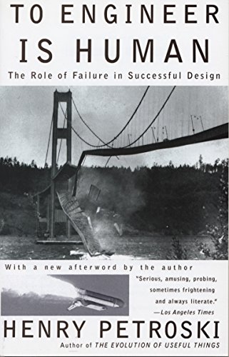
47. To Engineer Is Human: The Role of Failure in Successful Design
Sentiment score: 0
Number of reviews: 1
Vintage
 Show Reddit reviews
48. Anger-Free: Ten Basic Steps to Managing Your Anger
Sentiment score: 0
Number of reviews: 1
Used Book in Good Condition
 Show Reddit reviews
49. Bestiary: An Illuminated Alphabet of Medieval Beasts
Sentiment score: 0
Number of reviews: 1
Used Book in Good Condition
 Show Reddit reviews
50. Four Colors Suffice: How the Map Problem Was Solved
Sentiment score: 0
Number of reviews: 1
Used Book in Good Condition
 Show Reddit reviews
51. Massimo Bottura: Never Trust A Skinny Italian Chef
Sentiment score: 1
Number of reviews: 1
Massimo Bottura Never Trust a Skinny Italian Chef
 Show Reddit reviews
53. Don't Make Me Think, Revisited: A Common Sense Approach to Web Usability (3rd Edition) (Voices That Matter)
Sentiment score: 1
Number of reviews: 1
New Riders Publishing
 Show Reddit reviews
54. The Onion Book of Known Knowledge: A Definitive Encyclopaedia Of Existing Information
Sentiment score: 0
Number of reviews: 1
Little Brown and Company
 Show Reddit reviews
55. Fuzzy Bee and Friends (Touch and Feel Cloth Books)
Sentiment score: 0
Number of reviews: 1
Bright colors and textured fabrics make this book ideal for developing the senses!Fun rhyming text keeps children interested.
 Show Reddit reviews
56. Computers & Typesetting, Volume A: The TeXbook
Sentiment score: 1
Number of reviews: 1
 Show Reddit reviews
57. Visualizing Data
Sentiment score: -1
Number of reviews: 1
Used Book in Good Condition
 Show Reddit reviews
58. TREADWATER (TRDWTR): The Graphic Novel Part 1
Sentiment score: 0
Number of reviews: 1
 Show Reddit reviews
59. The Epiplectic Bicycle
Sentiment score: 0
Number of reviews: 1
Harcourt Brace and Company
 Show Reddit reviews
60. Meikosks Women's Christmas Sweatshirts Long Sleeve Pullover Loose Casual Tops Xmas Sweater Red
Sentiment score: 0
Number of reviews: 1
Blessed Shirt Funny Inspirational Teacher Fall Tees Tops Women's Basic V Neck Short Sleeve T Shirts Summer Casual Tops Women's Plus Size Short Sleeve V Neck T Shirt Womens Leopard Print Tops Short Sleeve Round Neck Casual T Shirts Tees Women's Colorblock Summer Short Sleeve Casual Loose T Shirt Crop...
 Show Reddit reviews
I'd recommend figuring out who's responsible and them giving them a copy of Don't Make Me Think. It's a relatively short book, so they might actually read it, then they might actually get some good ideas.
There is one programmer you should listen to about type.
While looking for a link, I came across a fascinating interview you might like to see (5'50 long): http://www.webofstories.com/play/17109?o=MS
Basically a book with that name.
Massimo Bottura is actually pretty cool though.
There is, in fact, a book that is completely dedicated to the subject. Imma just leave this here and walk away slowly: http://www.amazon.com/The-Dictionary-Corporate-Bullshit-Enraging/dp/0767920740
Disclaimer: I purchased a copy of this book once. It was "stolen" from my desk after a random sweep for exposed sensitive or confidential information. Oh! The subtle humor in that alone...
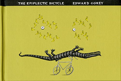
It reminds me of "the epiplectic bicycle", which was a bike in a kids' book of the same name, which was made into a short film. A custom bike builder liked it and built one that's actually rideable
If only there were some mathematical principle that could tell mapmakers how many different colors they'd need...
(If you want to read more about the matter, the book "Four Colors Suffice" is a thorough explanation of how the Four-Color Theorem was solved using early computers and a whole lot of human effort.)
Great explanation of this and other engineering failures in this book: To Engineer Is Human: The Role of Failure in Successful Design https://www.amazon.com/dp/0679734163/ref=cm_sw_r_cp_api_u7DUzbYPVVVET
so apparently it's a novel: http://www.amazon.com/TRDWTR-Graphic-Novel-Part-1/dp/0989898288/ref=sr_1_2?ie=UTF8&qid=1412103851&sr=8-2&keywords=trdwtr
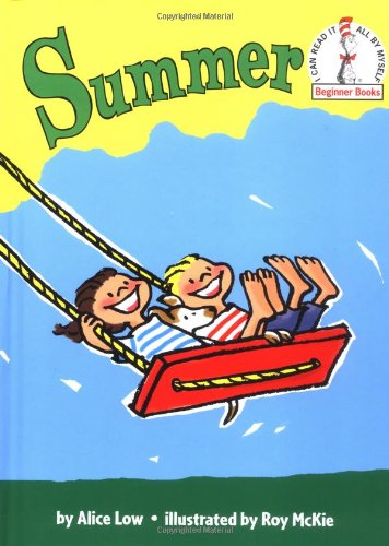
I had the Summer book growing up, I recognize the art style and dog.
Definitely faded. *couldn't find any spine angles
Still seems an odd choice of letters to highlight. Unless maybe the choice of black letters follows some sort of acronym used in the book or so.
https://www.amazon.co.uk/gp/aw/d/0007371462
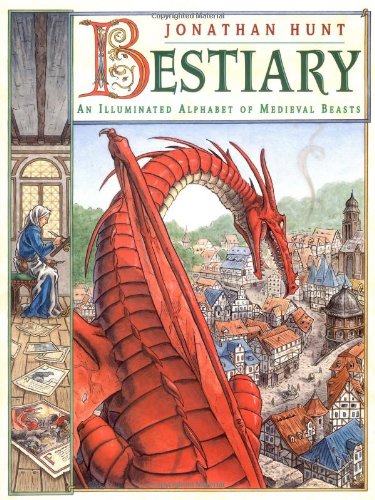
I think this may have been the one I read as a kid; "Bestiary: An Illuminated Alphabet of Medieval Beasts", by Jonathan Hunt
The Onion Book Of Known Knowledge
https://www.amazon.com/dp/1250124697/
In case someone wants to make this into a template
The actual title is Fire Shut Up in My Bones. This doesn't make the design any better, but that's just a confusing title in the first place.
The kindle version even costs more than the regular version... But at least it isn't $525 like the hardcover version
It's a satirical work.
It's a crap design, I'll give you that, but all the words are in the right order: Link
For the lazy:
http://www.amazon.com/Design-Everyday-Things-Donald-Norman/dp/0465067107Most recent version:
http://www.amazon.com/The-Design-Everyday-Things-Expanded/dp/0465050654/
It's a poor representation of data. In pie charts you compare angles. Humans are poor at comparing the magnitudes of angles. Without the table, labels with the actual numbers, etc. it would be very difficult to compare the information.
For instance, it is difficult based just on the visualization if Instinct or Valor has more players. A bar, column, or dot plot will show things much better. Humans are far better at perceiving differences in length or position. That table on the right is necessary - that means the pie chart is useless.
If you are serious about designing visualizations of data, I suggest you read some books by Willilam Cleveland or Edward Tufte.
EDIT: Here is article I often share with people on this topic.