Top products from r/logodesign
We found 13 product mentions on r/logodesign. We ranked the 11 resulting products by number of redditors who mentioned them. Here are the top 20.
1. Logo Design Love: A Guide to Creating Iconic Brand Identities, 2nd Edition
Sentiment score: 1
Number of reviews: 2
Logo Design Love A Guide to Creating Iconic Brand Identities 2nd Edition
 Show Reddit reviews
2. Signs and Symbols: Their Design and Meaning
Sentiment score: 0
Number of reviews: 1
Used Book in Good Condition
 Show Reddit reviews
3. Graphic Artist's Guild Handbook of Pricing and Ethical Guidelines
Sentiment score: 0
Number of reviews: 1
Graphic Artists Guild
 Show Reddit reviews
4. Designing Brand Identity: An Essential Guide for the Whole Branding Team, 4th Edition
Sentiment score: 1
Number of reviews: 1
John Wiley and Sons
 Show Reddit reviews
6. Design It Yourself Logos Letterheads and Business Cards: The Non-Designers Step-By-Step Guide
Sentiment score: 1
Number of reviews: 1
Used Book in Good Condition
 Show Reddit reviews
7. TM: The Untold Stories Behind 29 Classic Logos
Sentiment score: 0
Number of reviews: 1
 Show Reddit reviews
8. Moleskine Classic Notebook, Hard Cover, Large (5" x 8.25") Squared/Grid, Black, 240 Pages
Sentiment score: 1
Number of reviews: 1
CLASSIC MOLESKINE NOTEBOOK: Moleskine classic notebooks are perfect notebooks for writing journals, a daily diary, or note taking in college classes or meetings. Moleskine notebooks are beloved by travelers & bullet journalists for their slim design.DURABLE COVER & ELASTIC CLOSURE: Hold writing proj...
 Show Reddit reviews
9. Uni Kurutoga Mechanical Pencil Standard, 0.5mm, Violet (M54501P.12)
Sentiment score: 0
Number of reviews: 1
Uni Kurutoga Standard ModelLead Rotation Mechanics0.5mm Lead
 Show Reddit reviews
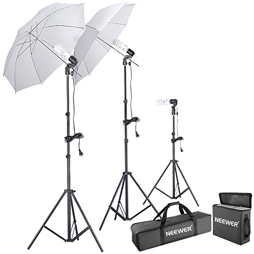
10. Neewer 600W 5500K Photo Studio Day Light Umbrella Continuous Lighting Kit
Sentiment score: 1
Number of reviews: 1
The umbrella continuous lighting kit includes:(2)33"/84cm White Translucent umbrella +(2)83"/210cm Tall Studio Light Stands+(1)31"/80cm Table Top Light Stand+(3)45W Day-Light Studio Light Bulbs+(3)Single Head Light Holder+(1)Umbrella Carry Case+(1)Bulb carry bagThis professional kit is perfect for a...
 Show Reddit reviews
11. Diamond Painting A5 LED Light Pad Board Tablet Portable Dimmable Brightness, LED Artcraft Tracing Light Pad Light Box for Artists Student Drawing, Must Have for Paint with Diamonds
Sentiment score: 1
Number of reviews: 1
(A5 Size+Diamond Paint Tool) – ►◄ DIAMOND PAINTING & Drawing Tracing TOOL - This diamond painting light box is particular design for full drill & partial drill diamond painting cross stitch rhinestone embroidery.ADJUSTABLE BRIGHTNESS – ►◄ Smart touch switch, long press the on/off button ...
 Show Reddit reviews
Basically you brand for an idea, feelings, values or maybe even a story/history .. and not a literal activity or object.
It sounds complicated but think of it this way. What does Nike's logo convey? Speed, momentum, agility. The exact messages are subjective but the overall theme is easily understood by consumers. Athletisism. Theres reasons why thier logo was never a shoe.. same for adidas.
This book will help.
https://www.amazon.com/Designing-Brand-Identity-Essential-Branding/dp/1118099206
As long as you use elements and compositions that communicate certain (sometimes abstract) ideas youll be fine! Slanted objects: movement. Heavy lines: strength. Leading lines: progress etc.
Definitely start with paper. Very sweet idea too. For anyone interested in an inexpensive light box they sell these on amazon in various sizes Diamond Painting A5 LED Light Pad Board Tablet Portable Dimmable Brightness, LED Artcraft Tracing Light Pad Light Box for Artists Student Drawing, Must Have for Paint with Diamonds https://www.amazon.com/dp/B07H6YMRWD/ref=cm_sw_r_cp_api_i_t1sUCb2H6062Q
these boyz. Check out the view of the inside with the graph. Good for sketching out things like this bc the grid is already there (plus I love the feel and texture of moleskines! They're my fave tbh
A lot of Youtubers have simple lighting kits that work really well and increase the quality of the video drastically. Something like this would work well for just starting out and it's super affordable.
http://www.amazon.com/Neewer-Umbrella-Continuous-Lighting-Photography/dp/B013JV3J1I/ref=sr_1_2?s=photo&ie=UTF8&qid=1463778143&sr=1-2-spons&keywords=lighting+kit&psc=1
Gonna second this and add in a book on logo design. I like this one for beginners:
http://www.amazon.com/Design-It-Yourself-Logos-Letterheads-Business-Newsletters/dp/1564967689
Then move on to the big one:
http://www.amazon.com/Logo-Design-Love-Creating-Identities/dp/0321985206/ref=sr_1_1?s=books&ie=UTF8&qid=1412518028&sr=1-1&keywords=logo+design
You could also use inkscape which is a free vector drawing tool.
This looks way too similar to the Uni-Ball Kuru Toga logo. Only it’s flipped, with a gradient. Might want to be careful with this design.
Look at the third picture, the logo mark on the right. Kuru Toga Engine
no problem :) Study Adrian Frutiger books. This will help you a lot with symbols. https://www.amazon.com/Signs-Symbols-Their-Design-Meaning/dp/0823048268 This is what graphic design students read.
The amazon link: http://www.amazon.com/TM-Untold-Stories-Behind-Classic/dp/1780671652
http://www.amazon.com/Graphic-Artists-Handbook-Pricing-Guidelines/dp/0932102166
Buy this. Read this. You're Welcome.
Logo Design Love by David Airey
It's too bad they don't have a web version of this book. I have found it very useful.
https://www.amazon.com/Color-Index-Revised-Jim-Krause/dp/1440302626