(Part 2) Top products from r/ArtCrit
We found 21 product mentions on r/ArtCrit. We ranked the 63 resulting products by number of redditors who mentioned them. Here are the products ranked 21-40. You can also go back to the previous section.
21. Classical Painting Atelier: A Contemporary Guide to Traditional Studio Practice
Sentiment score: 1
Number of reviews: 1
Watson-Guptill Publications
 Show Reddit reviews
23. Drawing Lessons from the Great Masters
Sentiment score: 1
Number of reviews: 1
Watson-Guptill Books-Drawing Lessons From The Great Masters
 Show Reddit reviews

26. Move Closer: An Intimate Philosophy of Art
Sentiment score: 1
Number of reviews: 1
 Show Reddit reviews
27. Drawing the Head and Figure: A How-To Handbook That Makes Drawing Easy
Sentiment score: 1
Number of reviews: 1
Product Details: Paperback: 128 pagesPublisher: Perigee Trade (January 15, 1983Language: English, ISBN-10: 0399507914, ISBN-13: 978-0399507915Product Dimensions: 10.8 x 8.1 x 0.5 inches, g Weight: 9.9 ounces (View shipping rates and policies)Average Customer Review: 4.7 out of 5 stars See all revi...
 Show Reddit reviews
28. Understanding Color: An Introduction for Designers
Sentiment score: 1
Number of reviews: 1
 Show Reddit reviews
29. Hawthorne on Painting (Dover Art Instruction)
Sentiment score: 1
Number of reviews: 1
 Show Reddit reviews
30. Constructive Anatomy (Dover Anatomy for Artists)
Sentiment score: 1
Number of reviews: 1
 Show Reddit reviews
31. The Human Machine (Dover Anatomy for Artists)
Sentiment score: 0
Number of reviews: 1
 Show Reddit reviews
32. Carlson's Guide to Landscape Painting
Sentiment score: 1
Number of reviews: 1
Carlson's Guide to Landscape Painting by John F. Carlson
 Show Reddit reviews
34. Perspective Made Easy (Dover Art Instruction)
Sentiment score: 1
Number of reviews: 1
Dover Publications
 Show Reddit reviews
35. How To Draw Comics The Marvel Way
Sentiment score: 1
Number of reviews: 1
Touchstone
 Show Reddit reviews
36. Imaginative Realism: How to Paint What Doesn't Exist (Volume 1) (James Gurney Art)
Sentiment score: 1
Number of reviews: 1
Andrews McMeel Publishing
 Show Reddit reviews
37. The Art of Learning: An Inner Journey to Optimal Performance
Sentiment score: 1
Number of reviews: 1
Free Press
 Show Reddit reviews
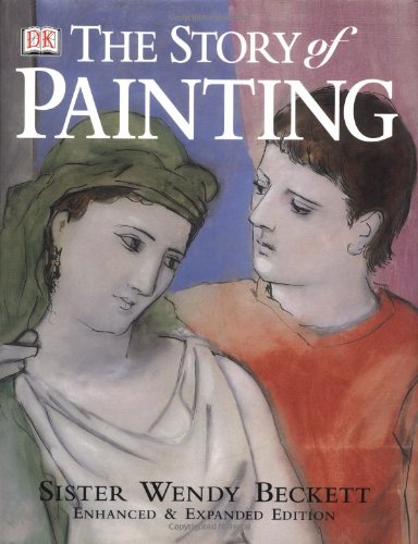
38. Sister Wendy's Story of Painting (Enhanced and Expanded Edition)
Sentiment score: 1
Number of reviews: 1
Used Book in Good Condition
 Show Reddit reviews

Hey! I graduated from IB in 2007 and did standard and higher level art, got a 6 out of 7 (I slacked a bit towards the end, senioritis). I then went on to do a 4 year Illustration program and graduated with a BFA. I hope you go down a similar path, art is very fulfilling and you seem to have some passion. Don't feel discouraged if your work doesn't yet match your ideas, you need to crank out tons of studies and eventually you'll feel yourself improving in leaps and bounds.
What IB really wants to see from you is a consistent theme. You've got a lot of experimentation in different media which is great, but I recommend you get some inspiration from art history. Just straight up copy old masters, if you see an old painting that you enjoy try to duplicate it and you'll understand it in a way you could never imagine. Try you hand at things like chalk pastels (Nu Pastel is a good brand), charcoal, watercolor, maybe even some oil paint. Avoid using small scratchy lines all the time, try flipping charcoal on its side and making broad strokes or get some powdered graphite and apply with a brush. A quote I try to live by: "Big artists use big brushes."
Find one or two types of media that really appeal to you and run with it, struggle with it, learn from it, study it, become bored with it, master it. I did digital painting for the most part which was sort of cutting-edge at the time and scored me some originality points and still to this day I work in that style.
Contemplate what you think is an interesting theme to make a series of artworks about, go to a local art gallery or museum and see how other artists approach themes. Get inspiration everywhere and write it down, lyrics in songs, things on the news, ideas in the shower. I did 'Creation / Destruction' as my theme and focused on the duality of the two through mythical stories of gods, warfare, self esteem and perception, yatta yatta. You're in high school, remember that this is a good time to just noodle around, try crazy shit, don't worry about being judged for failing, failure makes you better because you learn what not to do. And originality isn't the most important thing, imitate the art you love and once you feel you understand it you can tweak it.
Here's the biggest secrets I never knew in high school. Artworks are broken down into a few essential components, if you keep these concepts in mind you'll do much better.
The books I'd recommend are:
The Story of Painting
Imaginative Realism
Everything by Andrew Loomis (Free!)
Classical Painting Atelier
View these websites:
http://www.linesandcolors.com/
http://www.googleartproject.com/
http://gregnewbold.blogspot.com/
http://beardedroman.com/
http://www.artrenewal.org/
Good luck! My website is www.caycegoldberg.com so feel free to contact me if you want critiques or advice or whatever. And don't let the stress of IB take you down, stick through it. It's a tremendous struggle but it gives you a huge leg up on life, you'll appreciate it forever.
Alright bro rather than critique your work I'm going to directly answer your question on how to improve. I got two pieces of advice for you based on what I see.
First off, and it may sound a little vague but ask yourself honesty what do you want out of art? You say you tend to draw on and off in short burst, so do you really enjoy it? What do you see yourself creating if you possessed the required skills to do so? Try to find an answer to that question so you have a direction to work towards.
Secondly, "realism" in arts, to quote Wikipedia "is the attempt to represent subject matter truthfully, without artificiality and avoiding artistic conventions, implausible, exotic and supernatural elements" in other words to not add your own style to a drawing and capture purely what you see. Its really just life drawing, and I'm not exaggerating when I say you cannot become a competent or confident artist without learning, appreciating, and devoting time to mastering it. Realism is not a genera of art its the foundation, drawing as an art form has no shortcuts, that boring stuff an art teacher tries to make us do in art class such as drawing straight lines towards a horizon, or drawing a mannequin over and over aren't options that an artist can opt out of if he so chooses, like any science it's the basic background you require to frame your thinking and let creativity flow naturally through the canvas. If a musician doesn't know his scales how can he concentrate on giving the performance? Forget drawing freehand if you cant properly life draw. A human cannot be learned in sections, if we focus on things like eyes, the head, and hair, every other part will lack definition and consideration resulting in them fading into the background, the whole body must be considered. A regular adult male body is measured in about 8 heads in length starting from the actual head and moving down dividing the body into sections ending at the feet. If you study these landmarks along with the more specific ones than life drawing will become simplified and much more enjoyable.
I'm not leading you astray here, this is the hard truth about drawing, we all started for a reason but sooner or later we gotta decide how far are we gonna take this and how exactly we get there. If you really want to get serous about drawing, learn anatomy, learn perspective, and never focus on development a style, just concentrate on drawing and the style will occur. Start here for anatomy, because when it comes to anatomy Loomis is the authority and we are his students, he has many good books but this is probably his most popular. Though all of his books should be considered as they go into more detail on specific body parts such as hands and the head.
Then go here, it really is perspective made easy and is should probably be read first as a good understanding of perspective is required to properly frame drawing. Almost all of these books have PDFs that can downloaded for free since they were out of print at one point but were put back up for sale. If Loomis isn't your style you can check out this list, most of these have free PDFs as well which can simply be google searched.
But know that there is no foolproof formula to make you a great artist from books or even other great artist, its simply the courage to stand on ones own two feet and seek out enlightenment. I'm no art genius, all of this wisdom is from my personal experiences and lots of books. I just recognized your path as similar to mine and wanted to give some honest advice.
you have potential and its your choice if you want to see how far can you take it.
your proportions are off. if you're looking to improve on that, i recommend these two books-
How to Draw Comics the Marvel Way
The Art of Learning
the Marvel book will help with sketching and give you a really great grasp of the basics. it helped me so dam much and i still use it to this day.
The Art of Learning is a fantastic book! it has nothing to do with drawing or art itself, its all to do with learning. i got more from this book than any art teacher i've ever had. if you want to improve this is a must.
you might also want to try and use a reference too, that always helps.
check out posemaniacs for references to help with your anatomy or deviantArt's stock images that's always good
i hope what i've said helps you out
here's my real critique if you want it: You should try studying life drawing for a while. This drawing isn't successful, for too many reasons to get into, but that's ok. Just draw something every day.
Also go to the museum or wikipedia your favorite artists, learn about them, study their careers. DRAW EVERY DAY. Take in as much about art as you can, be open to ideas in art you think are bad. I see all the time people look at Pollock and go 'thats not art, i could do that' without trying to get it at all.
that last bit has very little to do with you, except in that I think it'd help you a lot to study as much as you can and DRAW EVERY DAY.
There is this awesome book called Drawing on the right side of the brain. It's helped millions learn to draw in proportion and perspective.
http://www.amazon.com/Drawing-Right-Side-Brain-Definitive/dp/1585429201
Then there's an art appreciation book called Move Closer. It's my favorite art theory book.
http://www.amazon.com/Move-Closer-Intimate-Philosophy-Art/dp/0374527822/ref=sr_1_2?s=books&ie=UTF8&qid=1369903747&sr=1-2&keywords=Move+Closer
Good luck and have fun.
Edit: just looked at your submission history, you know how to draw, u just trollin.
your perspective is off. pick up Perspective! for Comic Book Artists by David Chelsea. its really a shame he titled it what he did because millions of artists probably gloss over it thinking "bah, comic books! that's not what i do." but clearly it is what you do. so get it.
i have read a dozen books on perspective and this book is far and away the best. there are concepts it doesn't totally cover, and there are more advanced books for that. in terms of getting the idea across and learning there is no better book in my experience. and it has a lot of premade grids in the back to get you started.
You've made a beginner's mistake in assuming that dark = black. It is the other way around. Black is a dark color but it is only one of many. Many beginners use black to induce shadow (and produce light), but in earnest black and white are less useful for the final color composition. For some classical reference: On Divers Arts (amazon link), provides a very interesting set of instructions on the painting of flesh tones from 1122. Still, you likely won't get the best instructions from a 900 year old manual. Color (amazon link) is a great (really great) introduction to color theory.
As for composition, it mostly works in my opinion though I might suggest that the leaf under the eye on the right distracts from the eye itself. Furthermore, the clarity of the leaves and eyes causes the abstract shapes cutting through the painting to be called into question by their unspecific nature. Thereby, there are elements within the painting that are extremely specific and others that do not have purpose past compositional fixes. These 'edges' appear as though chrome and serve to transition and conjoin the disjointed elements within your piece and I might add have a flair for the surreal. I can only suggest that this comes off more as an ends to a means rather than as careful and pointed. Take the 'transition' away and your problem still remains, see what I mean?
Regards,
D
http://www.scribd.com/doc/2433658/Andrew-Loomis-Figure-Drawing-For-All-its-Worth
and
http://www.amazon.com/Drawing-Lessons-Great-Masters-Anniversary/dp/0823014010/ref=sr_1_1?ie=UTF8&qid=1302320757&sr=1-1-catcorr
Two figure classes I've taken have basically been taught straight out of these two books. There are others too that are as good or better. But that is a good starting place.
sure thing!
in this book https://www.amazon.com/Carlsons-Guide-Landscape-Painting-Carlson/dp/0486229270 he talks about integrating elements into the scene. I can't find a free version but it's definitely a good book even though it seems kind of old fashioned.
You got this!
I highly recommend Constructive Anatomy by George Bridgman. It's been the go-to book for learning figure drawing and has been used in college anatomy classes for decades.
Go get a big pad of newsprint and some charcoal sticks or charcoal pencils and redraw Bridgman's drawings. You will pick anatomy up incredibly quickly. And to keep it more interesting, skip around the book.
This is a pretty good beginning book: https://www.amazon.com/Drawing-Head-Figure-Jack-Hamm/dp/0399507914
if you've very serious about this and want to do realistic renderings, I would try practicing with bargue plates for a while: https://www.amazon.com/Charles-Bargue-Jean-L%C3%A9on-G%C3%A9r%C3%B4me-Ackerman/dp/2867702038/ref=sr_1_1?s=books&ie=UTF8&qid=1467062406&sr=1-1&keywords=barque
First glance I like what I see.
Second glance I see some orangutan hands going on here. Measure the distance from the wrist to the first knuckle joint at the base of the fingers and compare it to the length of the fingers themselves. See the problem?
Go to your library and get this book: http://www.amazon.com/Drawing-Dynamic-Hands-Burne-Hogarth/dp/0823013677
http://thedevildraws.tumblr.com/post/20445414784/robfunderburk-grim-natwick-anatomy-studies#disqus_thread
http://thedevildraws.tumblr.com/post/18993893591/anatomical-studies-of-the-hands-and-feet-as-done#disqus_thread
Now do this, go get a straight edge. Take the straight edge and place it against your brow and lips, see how those line up? The brow sticks out because it forms the socket that holds the eye ball, and the lips stick out because of their jaw structure and muscle and fat. But notice here in your drawing that the brow ridge is very flat and the angle of her face shoots out as her lips and jaw protrude? That's a facial aspect of large apes like gorillas not humans.
http://www.igorilla.org/assets/images/who/skulls4.jpg okay yes it's not quite as prominent as a gorilla, but you get the idea.
Don't be ashamed. Art history is a big part of art making, if only because most people who look at paintings have been exposed to the "big guys" of art (at least indirectly) their entire lives. Have you read Perpetual Inventory by Rosalind Krauss? I think you might like it.
Hogarth's Dynamic Anatomy. My favorite anatomy book of all time. Amazing illustrations, though it is grotesquely exaggerated in order to show, in detail, how the body deforms and contorts. Don't use this for reference, but instead for an example on where muscles are placed and how they twist and turn under stress.
http://www.amazon.com/Dynamic-Anatomy-Practical-Art-Books/dp/0823015513
The heads too big.The nech doesn't seem to be connected to the head.
You need to start studying anatomy. Buy some books by George Bridgman and copy at least three drawings a day every day. Find a drawing class in you area. Learn to measure and draw what you see. Learn basic human proportions. Learn the location and name of every major bone and muscle in the body.
If you flip the image horizontally, does it still feel a bit off?
I was reading a composition book yesterday that brought up why I think your image might feel a bit off...
If you can view page 101 in the 'book preview' (click on 'Search inside this book' then get to page 101..):
http://www.amazon.com/dp/0817441816/
while I think LadyPenyee is right that a cloud will add balance and make it feel less off, I'm wondering if the image might feel more flat as a result (?)