(Part 2) Top products from r/painting
We found 20 product mentions on r/painting. We ranked the 99 resulting products by number of redditors who mentioned them. Here are the products ranked 21-40. You can also go back to the previous section.
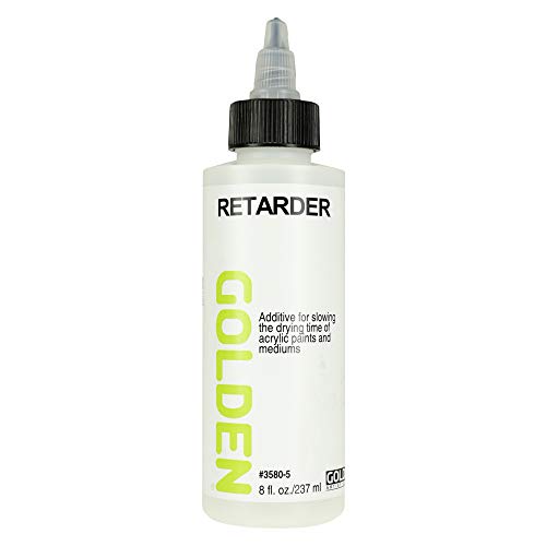
21. Golden 0003580-5 8 oz Artist Colors Acrylic Retarder Additive, Medium
Sentiment score: 1
Number of reviews: 1
Additive used to slow down the drying time of acrylic paintUseful for wet in wet techniques and reducing skinning on the paletteOne 8oz bottle Sold
 Show Reddit reviews
22. Magicfly French Easel with Sketch Box, Art Painting Easel for Adults with Shoulder Strap, Portable French Style Easels for Painting & Drawing, with Wooden Pallete
Sentiment score: 1
Number of reviews: 1
【Express Your Creativity】Magicfly portable easel for painting with wooden pallete is built for your creative works- painting, charcoal drawing, watercolor, sketching and more. It can be adjusted up to 71" height for people tall or small and hold canvas as large as 34", suitable for doing most of...
 Show Reddit reviews
23. Hawthorne on Painting (Dover Art Instruction)
Sentiment score: 0
Number of reviews: 1
 Show Reddit reviews
24. The Materials of the Artist and Their Use in Painting: With Notes on the Techniques of the Old Masters, Revised Edition
Sentiment score: 1
Number of reviews: 1
 Show Reddit reviews
25. Interaction of Color: Revised and Expanded Edition
Sentiment score: 1
Number of reviews: 1
 Show Reddit reviews
26. Interaction of Color: 50th Anniversary Edition
Sentiment score: 1
Number of reviews: 1
Interaction of Color
 Show Reddit reviews
28. The Elements of Color: A Treatise on the Color System of Johannes Itten Based on His Book the Art of Color
Sentiment score: 1
Number of reviews: 1
 Show Reddit reviews
29. Watercolor Painting For Dummies
Sentiment score: 0
Number of reviews: 1
Author: Colette PitcherSoftcover bookBook contains 294 pages
 Show Reddit reviews
30. Acrylic Painting For Dummies
Sentiment score: 0
Number of reviews: 1
Dimensions: 9.2 in. H x 7.46 in. W x 0.78 in. D
 Show Reddit reviews
31. The Elements of Color: A Treatise on the Color System of Johannes Itten Based on His Book the Art of Color
Sentiment score: 1
Number of reviews: 1
 Show Reddit reviews
33. Fun With A Pencil: How Everybody Can Easily Learn to Draw
Sentiment score: 1
Number of reviews: 1
Titan Books UK
 Show Reddit reviews
34. Creative Perspective for Artists and Illustrators (Dover Art Instruction)
Sentiment score: 1
Number of reviews: 1
 Show Reddit reviews
35. Color: A Natural History of the Palette
Sentiment score: 1
Number of reviews: 1
Random House Trade Paperbacks
 Show Reddit reviews
36. Classical Painting Atelier: A Contemporary Guide to Traditional Studio Practice
Sentiment score: 1
Number of reviews: 1
Watson-Guptill Publications
 Show Reddit reviews
37. Lessons in Classical Drawing: Essential Techniques from Inside the Atelier
Sentiment score: 1
Number of reviews: 1
Watson-Guptill
 Show Reddit reviews
38. The Oil Painting Course You've Always Wanted: Guided Lessons for Beginners and Experienced Artists
Sentiment score: 0
Number of reviews: 1
Watson-Guptill Publications
 Show Reddit reviews
Working cools vs warms is a little complicated. I recommend buying some painting books and color theory books to really know what I'm talking about. Basically decide what is going to be the structure of your painting, value or warm/cool shifts. So lets say you decide value (basically you'll find a lot if values, strong darks and lights). Warm/ cool shifts in this context could mean: most of the shadows will feel cooler than the lights (or vise versa). The way you mix that would be: shadows made of violets, greens, blues + a slight neutralizer (the opposite color) or a shade like black, or grey and the lights with bright versions or the hue shifted to things like red, yellows, oranges. (Know that context determines whether a color feels warm or cool. blue can be warm if surrounded by certain neutrals etc etc) However, instead of painting the shadow of on an arm brown, paint it violet. Warm cool shifts work best when there is little value. So if the shadow is Waaaaay darker than the highlight, don't push the violet too much. But let's say you decided to have little value in a painting and wanted space to be formed through warm/cools then make the highlights from red tints and the shadow from violet with no change or little change in value. You see this type of painting Impressionism to contemporary work and prior to Impressionism most painting is value based (due to pigments and the color theories of the time). Extreme values make an easy read for a work, while warm/cools play tricks on the eye and are visually unstable, which makes a painting visually develop over time (stand in front of some Rothko works and you'll know what I mean). It really depends on what you're going for. Also paint from life. Photos flatten things out tremendously and you'll see a lot more color and dimension from actual observation.
Color theory book I recommend: The Elements of Color:
http://amzn.com/0471289299
http://amzn.com/0300018460
http://amzn.com/0300115954
Painting technique book I also recommend:
Portrait Painting Atelier: Old Master Techniques and Contemporary Applications
http://amzn.com/082309927X
Sorry I'm on mobile and 3:30am so I am a but too exhausted to make those clickable. I look forward to seeing more of your paintings :)
A Cezanne portrait where his colors in the face do what I'm talking about (using color to make planar shifts or space) http://www.canvasreplicas.com/images/Paul%20Cezanne%20Self%20Portrait.jpg
A Degas based on warm cool shifts: http://uploads3.wikipaintings.org/images/edgar-degas/the-pink-dancers-before-the-ballet-1884.jpg
Oil and acrylic are different. They do different things and one is in no way better than the other. Golden makes an open acrylic with a longer open time that I really enjoy working with, and there are many retarding mediums that you can mix into your paints. Keeping your palette wet is very important as well. When blending it works best to either use many layers of color or work in smaller more manageable areas.
The best thing you can do is experiment and find what products and techniques work best for you.
For a first painting this is good, to get a better likeness pay attention to proportion. Check and recheck the eyes, nose and lips, if you get the relationship(measurements) between them right the rest of the picture falls into place. If you really want to improve check out these books, they'll give you some great pointers:
http://www.amazon.co.uk/Lessons-Classical-Drawing-Juliette-Aristides/dp/082300659X/ref=sr_1_1?ie=UTF8&qid=1346328001&sr=8-1
http://www.amazon.co.uk/Classical-Painting-Atelier-Contemporary-Traditional/dp/0823006581/ref=sr_1_3?ie=UTF8&qid=1346328001&sr=8-3
Good luck and keep at it :-)
This is the one I use
It’s super awesome! I received it as a gift from a family member and absolutely love it.
http://www.arc-store.com/bovica.html literally anything from here will teach you sort of the classical approach, but is pricey.
https://streamlineartvideo.com/ same thing for this, I have the Cesar Santos DVDs (about $200 each), and they're about 20 plus hours, start to finish, every step on how to create something.
Human Figure Book\ literally probably the best book you can get for drawing the figure
Alla Prima Book everything you need to know about oil painting
https://guidetooilpainting.com/ great website to learn the basics
​
It's a lot of practice, now I do watercolor paintings myself, but for oil paintings this is a great list of resources. It all kinda goes the same, you lay down and image and put the correct colors in the correct spots. I would say take more time with your drawing phase and the painting phase will be easier, but some like to go in w/ just a brush and attack it. Try things, suck for awhile and learn from it. I"m going to make a post about this to try and get some proper resources out there.
​
​
One book that was surprisingly helpful for me was Art School: How to Paint and Draw. I actually got it in the bargain bin at a book store.
A couple other helpful books are Problem Solving for Oil Painters and Color and Light.
Also, if you have an art studio around, sometimes they have cheap beginners classes. I've found those to be quite helpful starting out.
I have a brief amount of time so here's the short and skinny. You can use any colors you want, but traditionally you'd use primarily earth tones for the underpainting. Try this approach: stain the canvas with yellow ochre thinned with turpenoid/gamsol. Use a rag or cotton swabs to pull back out the light areas. Let that dry a bit, then continue with a value study using burnt/raw sienna and burnt umber. No need for white yet, just use the raw canvas. At this point you'll only want to be using thinner as your medium. When finished let it sit for a day or two to dry.
Now you may proceed with oil as your medium. You'll want to use more transparent pigments mixed with linseed/walnut oil to create glazes. Work in layers allowing time to dry in between. Don not varnish between layers. And more oil to your paints as you build up layers. Thick over thin process is to prevent cracking.
Good luck. Experiment. See what works for you. Look up artist handbooks on techniques. This one is generally considered the painter's bible.
PS If you use a thin blue wash adjacent to the orange of the Fox? DO consider that the yellowish patches in foreground and to left will turn greenish with blue wash (probably not good as “unintended consequence”) so consider leave the golden yellow patches-great warm contrast with cooler background colors. ( you could do practice study of similar colors in your painting with applied wash on separate paper before?)
You may be interested in color theory of “Simultaneous Contrast”https://www.liveabout.com/how-to-use-simultaneous-contrast-in-painting-4019832 and more “mind blowing” academic Josef Albers (100 years ago Bauhaus color interaction teacher/artist) changed my life as a painter! https://www.amazon.com/gp/product/0300179359/ref=dbs_a_def_awm_hsch_vapi_taft_p1_i0 (or iPad app)
However, better to paint with joy without thinking, get in the out of body zone!
Books or video on composition? I can recommend two books:
I got this from the library and so far I’m enjoying it
Mastering Composition: Techniques and Principles to Dramatically Improve Your Painting (Mastering (North Light Books)) https://www.amazon.com/dp/1581809247/ref=cm_sw_r_cp_api_i_39W8Ab8K4X8ZF
This was my textbook for my color and composition class
The Elements of Color: A Treatise on the Color System of Johannes Itten Based on His Book the Art of Color https://www.amazon.com/dp/0442240384/ref=cm_sw_r_cp_api_i_teX8AbVYTBXVT
This book is an excellent place to start if your interest is in space art. You might want to spend a little time on r/happytrees to get a basic understanding of landscapes in Bob Ross's style.
I bought this book for my painting teacher and he enjoyed it. All about the history of different pigments. Color: A Natural History of the Palette
Oh cool, you'll have fun with color theory then. I recommend you check out James Gurney's book Color & Light. You should also study up on perspective. This is the only book I can recommend that won't make your life hell.
If you both have no experience, then at least be sensible. First, do not buy supplies for her! I know that sounds romantic, but artists like to buy our own stuff. Second, if you must buy something, buy a beginner book that will start her out right. I personally started with How to Draw and Paint What You See by Ray Smith. He talks about supplies and materials in a simple manner.
Lastly, if she has no art experience, have her start simply with a pencil and paper. Drawing is the foundation to all art endeavors. Buy an inexpensive sketch pad and use a No. 2 pencil to get proficient in drawing before spending any money on paint. It will benefit her immensely to draw proficiently and understand it before learning to paint.
Acrylic Painting for Dummies
Watercolor Painting for Dummies
https://www.amazon.com/gp/product/0823032590/ref=oh_aui_detailpage_o01_s00?ie=UTF8&psc=1