(Part 3) Top products from r/painting
We found 20 product mentions on r/painting. We ranked the 99 resulting products by number of redditors who mentioned them. Here are the products ranked 41-60. You can also go back to the previous section.
41. The Elements of Color: A Treatise on the Color System of Johannes Itten Based on His Book the Art of Color
Sentiment score: 1
Number of reviews: 1
 Show Reddit reviews
43. Hawthorne on Painting (Dover Art Instruction)
Sentiment score: 0
Number of reviews: 1
 Show Reddit reviews
44. Creative Perspective for Artists and Illustrators (Dover Art Instruction)
Sentiment score: 1
Number of reviews: 1
 Show Reddit reviews
45. Color: A Natural History of the Palette
Sentiment score: 1
Number of reviews: 1
Random House Trade Paperbacks
 Show Reddit reviews
46. Classical Painting Atelier: A Contemporary Guide to Traditional Studio Practice
Sentiment score: 1
Number of reviews: 1
Watson-Guptill Publications
 Show Reddit reviews
47. Lessons in Classical Drawing: Essential Techniques from Inside the Atelier
Sentiment score: 1
Number of reviews: 1
Watson-Guptill
 Show Reddit reviews
48. Children's Writer's & Illustrator's Market 2016: The Most Trusted Guide to Getting Published
Sentiment score: 1
Number of reviews: 1
 Show Reddit reviews
49. Problem Solving for Oil Painters: Recognizing What's Gone Wrong and How to Make it Right
Sentiment score: 1
Number of reviews: 1
Watson-Guptill Publications
 Show Reddit reviews
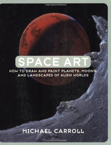
50. Space Art: How to Draw and Paint Planets, Moons, and Landscapes of Alien Worlds
Sentiment score: 1
Number of reviews: 1
 Show Reddit reviews
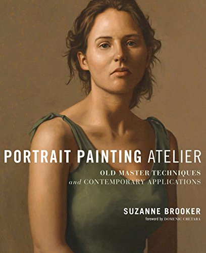
51. Portrait Painting Atelier: Old Master Techniques and Contemporary Applications
Sentiment score: 1
Number of reviews: 1
Watson-Guptill Publications
 Show Reddit reviews
52. Fun With A Pencil: How Everybody Can Easily Learn to Draw
Sentiment score: 1
Number of reviews: 1
Titan Books UK
 Show Reddit reviews
54. Why Cats Paint: A Theory of Feline Aesthetics
Sentiment score: 0
Number of reviews: 1
Ten Speed Press
 Show Reddit reviews
55. Alla Prima: Everything I Know About Painting
Sentiment score: 1
Number of reviews: 1
Missing dust jacket, has underlining throughout but still a good copy.
 Show Reddit reviews
56. Blue and Yellow Don't Make Green: How to Mix the Color You Really Want- Every Time
Sentiment score: 1
Number of reviews: 1
Excellent resource for both professional and amateur artists.
 Show Reddit reviews
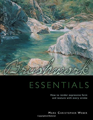
58. How to Paint Fast, Loose and Bold: Simple Techniques for Expressive Painting
Sentiment score: 1
Number of reviews: 1
 Show Reddit reviews

Wow, thank you!
I work in a pretty traditional way, blocking out everything with flat color, then building things up in layers. The block-in is dry when I start working details...for this one I did a lot of glazing and wet-on-wet work - no retarder medium on this one, though I don't hesitate to use it when I need to do smooth blending in large areas, like a sky during sunrise - to build up the volume on the stones. In a couple places to get some colors and values right, I used glazing or gel mediums to add some transparency.
To get the colors to pop, I try to carefully select my palette. Some of those yellows are actually quite dull, but look brighter because of the colors they're next to. I try to coordinate my colors, paying attention to complements and temperature (the shadows, for example, are very warm, using a warm blue mixed with burnt sienna...that makes the lighter blue glow a bit more, plus it is a sort of purplish-black, which complements yellow and so makes that stand out, too). I also have learned that it's important to pay attention to the opacity of your pigments. It's easier to get the sharp edges using opaque colors as opposed to transparent ones.
The other thing to keep in mind with edges: it's easier to make defined edges using contrast.
Sometimes for lightening colors, I will use a zinc white or unbleached titanium as opposed to titanium white. Titanium white can pastel-ize your colors easily. Zinc white or unbleached titanium can lighten your values without washing out the hue. It'll make a red a light red as opposed to a pink, if you know what I mean.
For paints, I use full body acrylics. For this, most everything was done using Liquitex Heavy Body paints, but I have a lot of student-grade paints that I intermix freely: Liquitex Basics, Daler-Rowney System 3 (a very underrated brand, imo...avoid their Simply... line, but System 3 is great and inexpensive) and even some really cruddy ones I found at my local Ocean State Job Lots. I wanted to use the pro-quality stuff on this one because I was concerned with lightfastness...I'm pretty sure he's got UV lights on that aquarium and I didn't want anything to fade.
Hope that helps! And thank you again. I'm humbled that you like my work.
ETA: My favorite books on the technical aspects of painting (so far) have been Painting in Acrylics: The Indispensible Guide by Lorena Kloosterboer and How to Paint Fast, Loose and Bold by Patty Mollica. Both of them have lots of information on color mixing and value, and I'm still working my way through applying the lessons I've learned from them.
Further edit: for what it's worth, I've never been able to use oils effectively at all. Acrylics are just a medium that speaks to me more...I might be coming to you for tips one day if I try to use oils again!
Edit3: I have a process pic gallery here to give you an idea how I did this one: https://imgur.com/a/yn1EiUZ
I'm assuming you're talking about freelance illustration since you mentioned art directors. Conferences are only helpful if you can actually have a face to face conversation with an art director. Yes, it's great to hear them lecture, but that won't do you any good in terms of developing a professional relationship. The best way to start with freelance illustration of a book that is published and updated every year : "The Children's Writer's & Illustrator's Market" This book is an absolute must, and make sure you get the most recent edition. There's often times turnover at publications, and you don't want to send an email to someone who doesn't work there anymore. The book is great because it lists every single publisher, agent, magazine, etc. that hires illustrators and it has the names of all the people to contact, along with specific information talking about what topics each person is interested in. The book also has articles throughout from writers and illustrators giving advice for how to develop your career.
You can also target specific publications you want to work for, and usually with a lot of Googling, you can find at the very least the name of the art director. Sometimes you can't find their email, in which case the second best thing is to snail mail them a postcard of your work with your contact info on the back. You should be doing that at least 1-2 times a year anyway to promote your work.
Working cools vs warms is a little complicated. I recommend buying some painting books and color theory books to really know what I'm talking about. Basically decide what is going to be the structure of your painting, value or warm/cool shifts. So lets say you decide value (basically you'll find a lot if values, strong darks and lights). Warm/ cool shifts in this context could mean: most of the shadows will feel cooler than the lights (or vise versa). The way you mix that would be: shadows made of violets, greens, blues + a slight neutralizer (the opposite color) or a shade like black, or grey and the lights with bright versions or the hue shifted to things like red, yellows, oranges. (Know that context determines whether a color feels warm or cool. blue can be warm if surrounded by certain neutrals etc etc) However, instead of painting the shadow of on an arm brown, paint it violet. Warm cool shifts work best when there is little value. So if the shadow is Waaaaay darker than the highlight, don't push the violet too much. But let's say you decided to have little value in a painting and wanted space to be formed through warm/cools then make the highlights from red tints and the shadow from violet with no change or little change in value. You see this type of painting Impressionism to contemporary work and prior to Impressionism most painting is value based (due to pigments and the color theories of the time). Extreme values make an easy read for a work, while warm/cools play tricks on the eye and are visually unstable, which makes a painting visually develop over time (stand in front of some Rothko works and you'll know what I mean). It really depends on what you're going for. Also paint from life. Photos flatten things out tremendously and you'll see a lot more color and dimension from actual observation.
Color theory book I recommend: The Elements of Color:
http://amzn.com/0471289299
http://amzn.com/0300018460
http://amzn.com/0300115954
Painting technique book I also recommend:
Portrait Painting Atelier: Old Master Techniques and Contemporary Applications
http://amzn.com/082309927X
Sorry I'm on mobile and 3:30am so I am a but too exhausted to make those clickable. I look forward to seeing more of your paintings :)
A Cezanne portrait where his colors in the face do what I'm talking about (using color to make planar shifts or space) http://www.canvasreplicas.com/images/Paul%20Cezanne%20Self%20Portrait.jpg
A Degas based on warm cool shifts: http://uploads3.wikipaintings.org/images/edgar-degas/the-pink-dancers-before-the-ballet-1884.jpg
For a first painting this is good, to get a better likeness pay attention to proportion. Check and recheck the eyes, nose and lips, if you get the relationship(measurements) between them right the rest of the picture falls into place. If you really want to improve check out these books, they'll give you some great pointers:
http://www.amazon.co.uk/Lessons-Classical-Drawing-Juliette-Aristides/dp/082300659X/ref=sr_1_1?ie=UTF8&qid=1346328001&sr=8-1
http://www.amazon.co.uk/Classical-Painting-Atelier-Contemporary-Traditional/dp/0823006581/ref=sr_1_3?ie=UTF8&qid=1346328001&sr=8-3
Good luck and keep at it :-)
http://www.arc-store.com/bovica.html literally anything from here will teach you sort of the classical approach, but is pricey.
https://streamlineartvideo.com/ same thing for this, I have the Cesar Santos DVDs (about $200 each), and they're about 20 plus hours, start to finish, every step on how to create something.
Human Figure Book\ literally probably the best book you can get for drawing the figure
Alla Prima Book everything you need to know about oil painting
https://guidetooilpainting.com/ great website to learn the basics
​
It's a lot of practice, now I do watercolor paintings myself, but for oil paintings this is a great list of resources. It all kinda goes the same, you lay down and image and put the correct colors in the correct spots. I would say take more time with your drawing phase and the painting phase will be easier, but some like to go in w/ just a brush and attack it. Try things, suck for awhile and learn from it. I"m going to make a post about this to try and get some proper resources out there.
​
​
It's a very wonderful painting! And I like that it has a healthy portion of drama too. The raindrop-effect is really interesting :)
​
But you have difficulties with perspective. May I suggest this book by José M. Parramon, you might be able to find it at your local library.
One book that was surprisingly helpful for me was Art School: How to Paint and Draw. I actually got it in the bargain bin at a book store.
A couple other helpful books are Problem Solving for Oil Painters and Color and Light.
Also, if you have an art studio around, sometimes they have cheap beginners classes. I've found those to be quite helpful starting out.
Books or video on composition? I can recommend two books:
I got this from the library and so far I’m enjoying it
Mastering Composition: Techniques and Principles to Dramatically Improve Your Painting (Mastering (North Light Books)) https://www.amazon.com/dp/1581809247/ref=cm_sw_r_cp_api_i_39W8Ab8K4X8ZF
This was my textbook for my color and composition class
The Elements of Color: A Treatise on the Color System of Johannes Itten Based on His Book the Art of Color https://www.amazon.com/dp/0442240384/ref=cm_sw_r_cp_api_i_teX8AbVYTBXVT
I'm nowhere near as good as I want to be, but there are two resources that made a dramatic improvement in my painting--ironically, one for portraits, and the other for mixing colors!
The first is a book on portrait painting. I wouldn't say that it made my portraits better, but by loosely following this guys process I can now do in hours what used to take me days. The book is Portraits from life in 29 steps by John Sanden. I found it at the local library and have checked it out several times.
Learning why mixing yellow and blue don't always make green (and red+blue≠purple, and yellow+red≠orange) really helped me get the colors I want. I started with the tutorial here:
How to choose a pallette
which led to this one:
The secret of colour mixing
I've watched YouTube videos on the same topic since then, but those are the tutorials that first opened my eyes to color bias.
This book is an excellent place to start if your interest is in space art. You might want to spend a little time on r/happytrees to get a basic understanding of landscapes in Bob Ross's style.
http://www.amazon.com/Brushwork-Essentials-Mark-Christopher-Weber/dp/1440306745
this book goes into detail about loading your brush, cleaning it and various types of brush strokes.. I saw a pdf version when i googled it. otherwise, your painting is pretty good for just starting in oils
I bought this book for my painting teacher and he enjoyed it. All about the history of different pigments. Color: A Natural History of the Palette
I love Blue and Yellow Don't Make Green. https://www.amazon.com/Blue-Yellow-Dont-Make-Green/dp/0967962870
Oh cool, you'll have fun with color theory then. I recommend you check out James Gurney's book Color & Light. You should also study up on perspective. This is the only book I can recommend that won't make your life hell.
While this is all well and good, and I agree with pretty much every sentiment in it, I don't think this is a good guide for actual painting. The best instruction I've ever received from text in the field of painting is a book called Hawthorne on Painting. For general art, I would also recommend a book called The War of Art. Both books are a huge kick in the ass in terms of getting work accomplished. Not to take away from the article linked here, but to say "there is no wrong way to make art" and "just paint," while both statements are true, neither really help you in accomplishing it.
Cats CAN paint! why Cats Paint