 Reddit reviews Color Wheel 245557 3505 Gray Scale and Value Finder, Black/White
We found 3 Reddit comments about Color Wheel 245557 3505 Gray Scale and Value Finder, Black/White. Here are the top ones, ranked by their Reddit score.
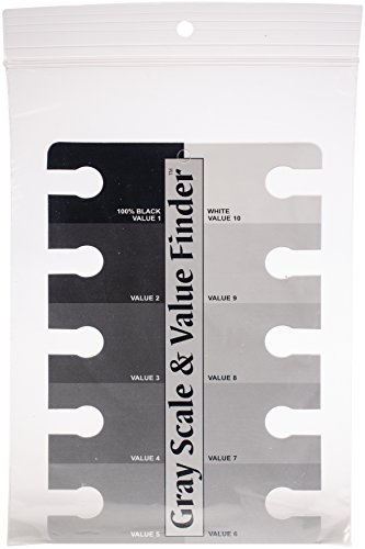
Perfect for determining color value in all mediaEasy to use and understandGuaranteed accurate readingGreat tool for artists, teachers and students
For when you're working traditionally, it helps to keep one of these handy. I got one last year after I saw Bradwynn Jones talking about his; it's helped me a lot when mixing paints to get the value I'm looking for.
When I'm working digitally, here's an exercise I did a lot when I started out and still do at least once before I start any new piece, just as a warm up. I start with color background that's at 50% on the value scale. (Any color will do as long as it's not actually gray. A neutral blue is usually what I go with.) I put down a black splotch on one side and a white one on the opposite, and then completely close the color sidebar to keep myself from cheating.
With a regular old hard round brush set to around 40% Flow and with the Flow keyed to pressure sensitivity, I hand-mix a splotch of 50% gray by eye right in the middle of the page. Then I mix a splotch that's halfway between that and the white and another for the black, so now I've got black, 75%, 50%, 25%, and white. Then I do another splotch halfway in between each of those til I end up with nine levels of white to black: black, 87%-ish, 75%, 62%-ish, 50%, etc.
Then I open the sidebar back up, use the eyedropper to sample each one, and see how close I actually got. If I didn't get within a couple of percent, I put down splotches of the grey I was trying to get next to the one I actually mixed to see how far off I was.
You can combine this with doing simple greyscale studies where you limit the number of gray tones you use. Like, you might do one with just black and white. Then do the same image, but add a 50% grey. Then do it again with 5 levels. Then do it again with 9 levels. Each time you have to use all the levels available to you and don't blend them.
If you're looking for a subject, set up a still life of all white-colored objects with a white background and set them under a strong directional light so you'll get very dark shadows.
The placement and shapes of the shadows are great. But the values don't look very accurate. Accurate values are huge for realism. One of these can help, and practicing with it will help you see value better.
Gray Scale and Value Finder https://www.amazon.com/dp/B007SQ2MIM/ref=cm_sw_r_cp_apa_i_ZeuVCbMVXT4M6
You can print your own or make one with pencil. I like to label which pencil I used for each value when I make my own.
For sketching or outlining you can use 2B or HB. It is actually not that relevant just don't press very hard because creates dents in the paper. (I do this all the time and it's bad practice.)
I use layering and usually go with 2B for the darkest shades then add a layer of HB then layer of 2H. Using layers is better than pressing hard because it does not smooth the paper. You can even do few layers with 2B to get a darker value. I use 4H for softening the edges.
A grayscale value can help you to decide how dark to go in different areas:
https://www.amazon.com/Color-Wheel-Scale-Value-Finder/dp/B007SQ2MIM/ref=sr_1_1?ie=UTF8&qid=1504839331&sr=8-1&keywords=grayscale+value+finder
Also the paper you use matters. If it is very smooth then it is even harder to get darker values. The one in the picture looks like it has a bit of a tooth to it which is good.