(Part 2) Best calligraphy guides according to redditors
We found 134 Reddit comments discussing the best calligraphy guides. We ranked the 67 resulting products by number of redditors who mentioned them. Here are the products ranked 21-40. You can also go back to the previous section.


Not a dumb question....that is page 22 of Arrighi's La Operina. Born Ludovicus Vincentinus, he was a scribe in the Papal Chancery. By pure luck, Arrighi, a master scribe, met a master carver, Ugo da Carpi, who carved the woodblocks that printed the 32 pages of La Operina which in 1522 became the first printed calligraphy book. It is a beautiful example of Chancery Cursive which has become better known as Italic today. It was followed by many printed calligraphy example books and by the 1700 was largely forgotten until a facsimilie was produced in the 1920. 300 copies were printed in Switzerland by Fredric Warde and the forward was by Stanley Morrison. I understand that the facsimilie was very influential in Alfred Fairbanks lettering and book, among other prominent 20th C calligraphers.
Perhaps the best modern translation and study is Arrighi's Running Hand by Paul Standard. My copy is well used and I show it to beginners when I teach Italics. I often use the book as practice like this extract of page 13
Apologies for long answer.
TLDR Arrighi's Running Hand discussion
Check out The Calligrapher’s Business Handbook. It walks you through exactly how to price your items. There’s a method of figuring out your hourly rate, adding on for taxes and materials, and then converting that into a per item price.
https://www.amazon.com/Calligraphers-Business-Handbook-Policies-Lettering/dp/1545300496/ref=nodl_
I also really liked Panic Free Pricing by The Happy Ever Crafter. It also walks you through pricing items in a similar way and has tons of actual examples of what calligraphers charged. The guide is quite long and comes with videos but is pricey. I bought it when it was on sale so it might go on sale again.
https://thehappyevercrafter.teachable.com/p/panic-free-pricing/?affcode=254428_tixfyqie
The key is you actually don’t want to under price your work because you think you’re not good enough. That can hurt the calligraphy community as a whole because people think calligraphy services should be cheaper than they really are.
In short, not really. Graffiti tags / handstyles, no matter how weird and wild they are, still have typography roots. Many quality graffiti handstyles could be compared to quality sign painting styles – a lot of overlap. If you're looking to develop a clean, refined, and traditional style then studying traditional sign painting would be my recommendation. Calligraphy, typography (the study of type in general), and drawing letters in a traditional format will all contribute to your knowledge of lettering in general. Then graffiti styles will follow after studying and practicing it more. After I started getting really into type, hand lettering, and fonts in general is when I noticed my overall tag styles improve the greatest. The rest is just a ridiculous amount of practice. Like going through multiple phone books, thousands of pens, and cans of paint.
Here's some links, I haven't checked all the books personally but I have a few of them:
seanwes.com/learn/
http://www.amazon.com/Sign-Painters-Faythe-Levine/dp/1616890835/ref=pd_sim_b_2?ie=UTF8&refRID=18KCM0XRJB2Y65NMC6F7
http://www.amazon.com/Shadow-Type-Classic-Three-Dimensional-Lettering/dp/0500516995/ref=pd_sim_b_14?ie=UTF8&refRID=18KCM0XRJB2Y65NMC6F7
http://www.amazon.com/Mack-Brush-Freehand-Lettering-EDUCATIONAL/dp/B0046DK1EC/ref=pd_sim_b_9?ie=UTF8&refRID=18KCM0XRJB2Y65NMC6F7
http://www.amazon.com/The-Hand-Lettering-Helm-Wotzkow/dp/0486217973/ref=pd_sim_b_3?ie=UTF8&refRID=18KCM0XRJB2Y65NMC6F7
https://www.google.com/search?q=sign+painting+techniques&safe=off&espv=2&biw=1535&bih=1039&tbm=isch&tbo=u&source=univ&sa=X&ei=82p_VInZEsP7ggSK5oDQAg&ved=0CCYQsAQ
https://www.google.com/search?q=sign+painting+techniques&safe=off&espv=2&biw=1535&bih=1039&tbm=isch&tbo=u&source=univ&sa=X&ei=82p_VInZEsP7ggSK5oDQAg&ved=0CCYQsAQ#safe=off&tbm=isch&q=hand+drawn+letter+techniques
One of my favorites:
https://www.google.com/search?q=herb+lubalin&safe=off&hl=en&biw=1535&bih=1039&source=lnms&tbm=isch&sa=X&ei=5Gt_VKa8BcSVNqm1gbgJ&sqi=2&ved=0CAYQ_AUoAQ
I'm new to design and I found these books to be a really interesting and helpful starting point: Color Design Workbook (Terry Lee Stone et al) and Lessons in Typography (Jim Krause). The Krause book was especially well done, so I imagine that the other books he's written are also very good. Just a bit expensive.
Other than that, it seems that just putting yourself out there and creating stuff is the best way to learn. Maybe offer to do stuff for free if you don't have your own ideas for projects to work on.
Also, if you're a student, Adobe Creative Cloud is 20€/month! Just gotta provide proof.
Just fyi, Annie's book can be found for a very modest price used. Amazon
The flow and layout is nice but overall the lettering could use some work.
Good luck!
ps: just a note. this book is where I learned most of these tips. It is amazing in the way it can give you simple tips to make your lettering exponentially better. I would recommend trying to buy it.
Coptics are super popular for one reason: They lay flat. A lot of folks love this for sketchbooks. I hate them though. Too much play in the spine means it wiggles a lot and just doesn't feel right to me.
The spine is not going to be too much more worn than any other structure. Paper and linen thread are actually really strong. Like I said, Coptics are favored for sketchbooks, which means they survive being thrown into bags and stand up to a lot of abuse.
There are literally hundreds of different types of bindings. Coptics are actually on of the oldest types of a codex binding, being developed in Africa in the 2nd century CE. Some use only thread to hold the book together and are called non-adhesive bindings. Others use only glue and are called adhesive bindings. Some use both thread and glue. "Regular binding", that you mention is not the name of any binding I'm familiar with. Is that a link stitch? Sewing all along on tapes or cords? Book binding has been around for literally thousands of years, so there are a lot of different structures.
Each binding has it's own advantages and disadvantages, and which one to use on which book depends on size, type of paper used to print on, and desired look and functionality. I went to school for two years to learn all this stuff and to practice a ton of different structures. If you're looking for something to get you started when it comes to traditional Western bookbinding, check out Laura Young's Book or Edith Diehl's. They explain a lot of structures pretty well and are something every binder should read.
If you don't have any guilds or calligraphy societies close to you, then this sub is a good place to start. Read through the wiki, the BestOf, the DullTuesday threads from the past. Look at the constructive criticism posted by other calligraphers on other posts here, and glean something from it for your own practice.
If you're interested in this particular style, the script is called Italic and it's one of the foundational scripts for broad edge calligraphers--a good place to start. I'd highly recommend Sheila Waters' or Annie Cicale's book.
probably gonna pick one up
if you dont know who Shoe is, he coined the term calligraffiti and has been the founder of the team. go check out his work now! his downstroke is destructive. style for years. now he's painting with plants and it looks dope.
check out one of his recent works, Poppy Pigeon with Adele Renault here too
That isn't running script (and it isn't handwriting either, but actual artistic calligraphy). While there are some minor tendencies that are more in favor in Japan or in China, the five classical styles (seal, clerical, kai, running, cursive) are the same in both countries, and in Japanese Shodō classes we often use Chinese calligraphers as models, such as Yán Zhēnqīng or Wáng Xīzhī, including for cursive (of course, we use famous Japanese calligraphers too!)
And, indeed, in the running style—in Japan as well as China—the characters have roughly the same size, though they start to meld together at the cursive end of the spectrum (in particular, vertical kana joins and stretches very easily, because technically hirana are fully cursive kanji anyway). The running style in old Japan was the basis for education (differently from today, where kai is the fundament), so it doesn't get too wild. In the same manner, Chinese artistic calligraphy will get irregular too.
Japan does have its particular native developments in calligraphy (notably, kana calligraphy, which is more delicate than the cursive from which it originates; free, unconstrained bokuseki; and, in postwar times, the new abstract calligraphy with influences from modern art). But this post was about handwriting, not calligraphy; and the kind of characters we see in everyday Japanese handwriting are clearly derived from the classical kai and running styles (kaisho 楷書、gyōsho 行書), depending on the person and situation. For example, this note my essay teacher scribbled in red pen is textbook gyōsho.
I recommend this book, which I have:
http://www.amazon.com/Brush-Lettering-Instructional-Manual-Western/dp/1558212698/ref=sr_1_1?s=books&ie=UTF8&qid=1421268012&sr=1-1&keywords=brush+lettering
Hand to Type: Scripts, Hand-Lettering and Calligraphy is a cool book!
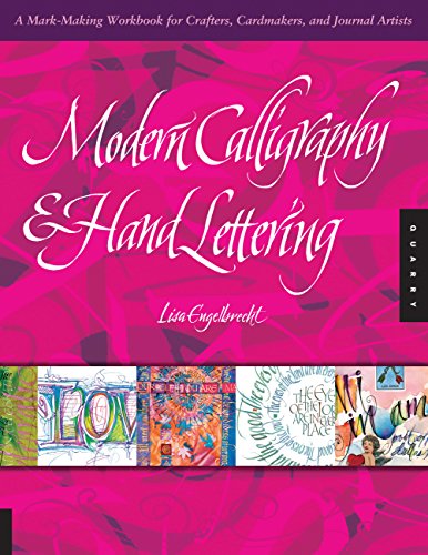
First of all you NEED this book, it has it all like seriously all,the tools the strokes the history - the chapter on brush lettering alone is worth the purchase.
(in case the link doesn't work the book is called Modern Calligraphy and Hand Lettering by Lisa Engelbercht)
http://www.amazon.com/Modern-Calligraphy-Hand-Lettering-Mark-Making/dp/1592536441
Then you need to watch this series of videos by Eliza Holliday, she shows the dynamics of the process and keeps it fairly simple and easy to understand - though there are others i found this one to be the most useful.
http://www.youtube.com/watch?v=uIxiW_aMiF8
And then you need a fuckton of practice because the Pentel Pocket brush can be a little bitch sometimes but gets the job done - also you might want to get a couple of other brushpens along the way just to make sure you can control all types and be efficent with any tool.
Hope this helps
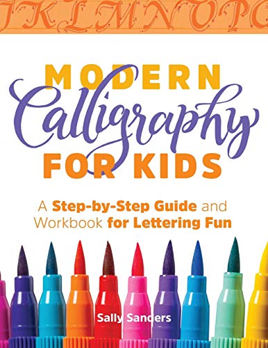
Possibly! My mom (a calligrapher of 20+ years) just came back from a workshop in which someone in her group just had this workbook published. Lots of incredible tips that most books do not discuss. (Note - the title is a bit of a misnomer as the book is certainly more in depth than what would be for a kids’ audience).
Modern Calligraphy for Kids by Sally Sanders
After your suggestions my current amazon cart for her is:
Calligraphy: A Beginner's Guide to Pointed Pen and Brush Pen Lettering
Hand Lettering for Relaxation: An Inspirational Workbook for Creating Beautiful Lettered Art
Strathmore 300 Series Drawing Pad, Medium Surface, 9"x12" Glue Bound, 50 Sheets
Rhodia No.16 A5 6 x 8 1/4 80 Sheet, Dot Pad.
Tombow 56191 Advanced Lettering Set.
Pilot Parallel Pen 2-Color Calligraphy Pen Set, with Black and Red Ink Cartridges in 2.4mm Nib size and 3.8mm Nib size with extra 12 assorted colors cartridges and 12 black cartridges. I assume the cartridges are not dependent on nib size as that would be infuriatingly stupid. Only dependent on the brands pen circumference? Correct me if I am wrong on that.
Hopefully that's pretty comprehensive but as far as speedball goes these are the texts I've found:
Speedball Textbook 24th Edition for $8.67.
Speedball Textbook: For Pen and Brush Lettering, 20th Edition for $113.35.
The Speedball Textbook, a comprehensive Guide to Pen and Brush Lettering, 23rd, Twenth-Third Edition for $51.01 new.
Did you have a specific edition in mind? A lot of the ones I'm seeing on amazon vary greatly as shown above.
I've been learning from Start Calligraphy by Maureen Sulllivan, I haven't been very happy with the book and suspected that it's her own spin on the hands as opposed to staying with the traditional forms.
I've also got Mastering the Art of Calligraphy by Janet Mehigan, but that seems to use the same letter forms as the previous book.
Thank you for the additional sources, I look forward to going through them.
It’s this one I bought in Germany. The alphabet is the same. Actually I’m not too particular about which book to use, I just chose 1 book that has different styles to keep myself practicing :).
Here’s a practice book with the alphabet I found on Amazon. I ordered it to practice!
French-Ruled Seye Practice Notebook: With Instructions And Alphabet Examples https://www.amazon.com/dp/1983516341/ref=cm_sw_r_cp_api_i_-GxjDbQV1FK50
best of luck! And take all the training they offer you, never miss a chance to better your skills (especially if they'll translate to the civilian world). (Source: my brother in the Army.)
I would love to get this to drool over the pretty scripts and hopefully get my sister the artist to learn how to do :)
Thank you so much!
I don't keep a specific size for my letters from paper to paoer, but I do scale them, so the baseline (size of an o) is 1/3 of the total height.
For example in this picture my base is 1 cm (which was too tall tbh!), with 2 cm above and below.
This also shows it: https://goo.gl/images/UBHQIG
When I just started I ordered this: https://www.amazon.com/dp/1537282042/ref=cm_sw_r_cp_apa_SInWAb9VZGQ38
IMO the paper bleeds too much, and I have to draw slant lines myself so I use it for practicing, and then when things have to be pretty I use some watercolour paper from my local craft store, and draw guidelines myself (that's what you can see on the picture).
My best advise is just to jump into it. :)
I did notice the similarity. I've been looking at the few difference "italic cursive" forms that are out there. I did get a copy of this Arrighi's Running Hand book but I think I need to pick up a more modern one as well to practice from.
However, right now.. I'm actually mostly focusing on basic American cursive. I'd like to be "decent" at both styles. I love how some of the flourishes can look in cursive for writing little notes, cards, letters.. I love the speed and readability of italic for work notes, meetings, journaling, etc.
This, in the absence of an on-line edition of Edith Diehl's seminal work "Bookbinding: Its Background and Technique", is an excellent survey of the state of traditional binding as it stood ca 1910, in the US, France, and the UK.
Some of the techniques may no longer be advised, but this is a decent free, readable, illustrated introduction to hand bookbinding, if somewhat oversimplified.
I wince at the sawing of the backs, but it was common then, and certainly common now... And the book is no guarantee of success, given that there's no replacement for instruction and practice under the direction of someone who knows what they are doing. But it's still a good overview.
Even Edith Diehl, who does go into many subtleties, glosses over things. This just glosses a bit more. Still, it's a good start-to-finish overview.
EDIT: formatting
Whenever I first got into by doing the examples in thisbook
Edit: pardon my englais, it isn't my first language