(Part 2) Top products from r/colorists
We found 11 product mentions on r/colorists. We ranked the 31 resulting products by number of redditors who mentioned them. Here are the products ranked 21-40. You can also go back to the previous section.
21. Blackmagic Design UltraStudio Mini Monitor
Sentiment score: 1
Number of reviews: 1
ULTRASTUDIO MINI MONITOR - Ultra small pocket sized Thunderbolt powered playback for SDI and HDMIPURPOSE - When you need low cost monitoring for editing, then UltraStudio Mini Monitor is perfectFLEXIBILITY AND QUALITY - UltraStudio supports a massive range of video formats and resolutions combined w...
 Show Reddit reviews
22. Asus ProArt PA248Q 24.1 Inch LED Monitor
Sentiment score: 1
Number of reviews: 1
True Resolution : 1920x1200; Display Colors : 16.7MHdcp Supported : YesHorizontal Viewing Angle - 178; Vertical Viewing Angle - 178
 Show Reddit reviews
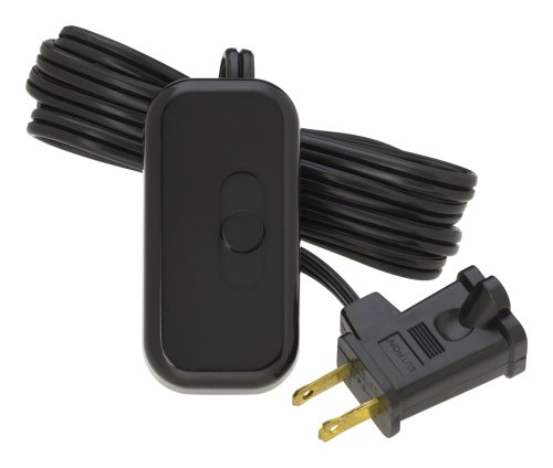
23. 12' Hanging Lantern Cord with On/Off Switch by Whirled Planet® (White) UL Listed
Sentiment score: 1
Number of reviews: 1
UL LISTED for safety and quality you can TRUST12' LONG LANTERN CORD with on/off switch conveniently located midway on cord (6' from plug)STANDARD LIGHT BULB fits easily and securely in socketVERSATILE small sized socket works for a variety of projects including puzzle lights, star lamps, Chinese pap...
 Show Reddit reviews
24. Weddingstar Round Paper Lantern, 16", White
Sentiment score: 1
Number of reviews: 1
Available in various colorsAvailable in various sizes16-inch diameterMix and match the colors and sizes to customize the lanterns to your individual needsPaper Lanterns only, lights not included
 Show Reddit reviews
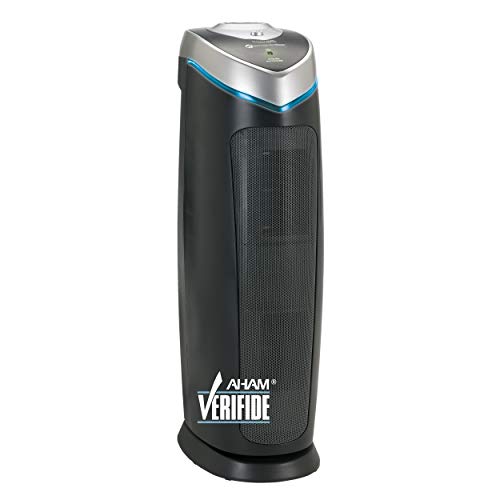
25. Germ Guardian True HEPA Filter Air Purifier with UV Light Sanitizer, Eliminates Germs, Filters Allergies, Pollen, Smoke, Dust Pet Dander, Mold Odors, Quiet 22 inch 4-in-1 Air Purifier for Home AC4825E
Sentiment score: 0
Number of reviews: 1
4-IN-1 AIR PURIFIER FOR HOME : True HEPA air filter reduces up to 99.97% of harmful germs, dust, pollen, pet dander, mold spores, and other allergens as small as .3 microns from the airKILLS GERMS UV-C light helps kill airborne viruses such as influenza, staph, rhinovirus, and works with Titanium Di...
 Show Reddit reviews
26. Lutron Credenza LED+ Plug-In Lamp Dimmer Switch for dimmable LED, Halogen and Incandescent Bulbs | TTCL-100H-BL | Black
Sentiment score: 1
Number of reviews: 1
Provides the best dimming performance for dimmable LED bulbs (for list of approved LED bulbs, view Technical Specification" below)Works with up to 100 Watts of dimmable LEDs or 300 Watts of Halogen or Incandescent BulbsDims table and floor lamps to suit any activityEasy slide operation allows you to...
 Show Reddit reviews
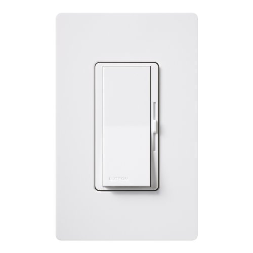
27. Lutron Diva LED+ Dimmer for Dimmable LED, Halogen and Incandescent Bulbs with Wallplate | Single-Pole or 3-Way | DVWCL-153PH-WH | White
Sentiment score: 1
Number of reviews: 1
Provides the best dimming performance for LED bulbs (for list of approved LEDs, see 'Technical Specification' below)For use with up to 150-Watts of dimmable LEDs or up to 600-Watts of Incandescent or Halogen bulbsFeatures a large rocker paddle to turn lights on/off or to preset level and a discreet ...
 Show Reddit reviews
28. Real World Color Management (2nd Edition)
Sentiment score: 1
Number of reviews: 1
 Show Reddit reviews
29. The Art and Technique of Digital Color Correction
Sentiment score: 1
Number of reviews: 1
 Show Reddit reviews

Don't spend money to build a room just yet, lets take this from the beginning. Having all the right tools in the world isn't going to help you from ground zero.
The software I use to do 85% of my professional work up to 4K/UHD is Blackmagic Resolve, and it is available for 0$. Totally free. Make sure you have a computer that can run it.
https://www.blackmagicdesign.com/products/davinciresolve
(Download link on page)
Read the resolve manual included in the installer package. Written by Alexis Van Hurkman http://www.alexisvanhurkman.com/wordpress/
It basically can teach you the fundamentals of color, through explaining features of the program.
His Ripple Training is also very comprehensive and something to look at. http://www.rippletraining.com/products/davinci-resolve/davinci-resolve-12-5-core-training-bundle/
That being said, you should also read the following books:
Begin with this:
Color Correction Handbook also by Van Hurkman
https://www.amazon.com/gp/product/0321929667/ref=pd_sbs_14_t_1?ie=UTF8&psc=1&refRID=QEGXRDSHFHYDDGD6QTX8
If you really want to go deep:
Color and Mastering for Digital Cinema
https://www.amazon.com/Mastering-Digital-Cinema-Industry-Handbook/dp/0240808746
All that being said, a basic foundation in color can also be gained through stills manipulation in lightroom or photoshop first. This is how I learned, and I feel like it really gave me a head start.
http://www.cambridgeincolour.com/tutorials.htm
Read EVERY ONE OF THESE TUTORIALS. This site is an amazing resource for all levels of mastery, I find myself going back to it again and again to refresh and then reach deeper into the void.
(Disclaimer: I am NOT Alexis Van Hurkman, he's just a good dude, and kinda unavoidable when it comes to learning Resolve, since he literally was contracted to write the manual. Also hes good.)
Anyway. Once you've chewed through all that, youll either find its not for you, or youll be back for more, and youll have a much more targeted idea of what your first gear purchase should be to help you get the most milage.
You can do a lot of great work without any gear. Learn how to use the scopes, then a monitor can come later.
Hope this helps.
This is going to be very difficult to achieve with a T2i. Much of the detail is in the shadows, which the T2i doesn't capture very well.
Start with some ND on the windows. I'd start with knocking them back 2 stops, but you'll likely need more. After that add some fill light from something soft at camera right. Maybe 3x china balls in a line to keep the cost down. I'd love a 4-bank here, but the paper lanterns are a very affordable way to get some soft light. Since you're shooting agains the sun be sure to put daylight balanced lights in them. 2700-3200k warm lights are going to give you color balance woes.
The goal with the lighting is to try to bring the dynamic range into something a T2i can record. The difference from dark to light here is the problem. Cameras that shoot raw or log formats are more equipped for this shot.
---
As for color, the people in this sub will have better advice. I'm not really a color person, but I'll take a crack and hopefully someone can tell you what I'm wrong about.
For starters desaturate the shit out of what you shot. This starts with art direction, continues into set design, and finally ends in post. You can only be as successful as what the camera is allowed to record.
Next you need to lift the pedestal. The blacks should be pretty milky. This is something the T2i will struggle to do elegantly as its encoder doesn't give you a lot of shadow detail. Pull up the bottom point of a curves layer up 15ish percent. After that add a point a little bit up the line and lift that even more. Work the curves after that to get toning that you like. It doesn't have to be final, but try to get it much of the way there. What you really need will vary based on your shot.
Next I believe (could be my laptop screen leading me astray) the shadows have a slight purple tint. Add that with a 3-way. Use the same 3-way to push your midtones towards green. Also push your highlights towards the same green. You might push the highlights slightly more towards yellow or orange than you did the mids. The midtones are pushing further on the color wheels, so make sure that point is further from the center of the wheel than the highlights point is. Note that you'll probably need to adjust the pivot point for the shadows-to-midtones transition and work the curves from above to get that changeover happening where you like it.
Add a soft dark correction to the room using some sort of soft mask to target that area more specifically. If the camera moves a lot your mask is going to need to change to compensate.
After that get some grain going on. Add a final curves to get the toning you want to finish with.
---
Now hopefully I've said something wrong along the way. Nothing brings out good advice like giving bad advice. :-)
$170 will not get you a colour accurate monitor the cheapest you can get would be around $450. For [$320] (https://www.amazon.com/Asus-ProArt-PA248Q-24-1-Monitor/dp/B00877ZOYK/ref=sr_1_4?ie=UTF8&qid=1479170951&sr=8-4&keywords=adobe+rgb+monitor) you can get an adobe rgp acurate monitor (for print). Or if you are going really cheap but want something that you can kind of trust then your best bet will be a dell ultrasharp, but that will still be a bit over $200.
I use Quasar Science A Series LED's in my room. They have a phenomenal CRI/TLCI/CCT measurement. Measurements can be found here: http://indiecinemaacademy.com/complete-led-color-database-cri-tlci-cqs-tm30-15/
Bulbs: https://www.quasarscience.com/collections/a-series-led/products/a-series-medium-base-household-bulbs?variant=3582653571
My walls are also painted with spectrally neutral paint: http://www.rpimaging.com/munsell-neutral-gray-paint.html
Edit: Also if you get those bulbs and want to turn them into dimmable "smart bulbs". Take a look at getting one of these. https://www.amazon.com/Lutron-P-BDG-PKG2P-Wireless-Lighting-Kit-Enabled/dp/B011PHGURS/ref=sr_1_1?ie=UTF8&qid=1460642331&sr=8-1&keywords=B011PHGURS or if you just want a cheap LED dimmer look at this https://www.amazon.com/Lutron-TTCL-100H-BL-Credenza-Dimmable-Dimmer/dp/B004DZONXI/ref=sr_1_9?ie=UTF8&qid=1506395376&sr=8-9&keywords=lutron+led+dimmer
Lutron CL dimmers have no issues with Quasar Science LEDs and are recommended by them as well. You can even swap out your existing wall dimmers with them: https://www.amazon.com/Lutron-DVWCL-153PH-WH-Dimmable-Dimmer-Wallplate/dp/B004C2WTLU/ref=sr_1_3?s=lamps-light&ie=UTF8&qid=1506395557&sr=1-3&keywords=lutron+cl
For starters, I think this book has helped me a lot:
Color Correction Handbook: Professional Techniques for Video and Cinema (2nd Edition) (Digital Video & Audio Editing Courses) https://www.amazon.com/dp/0321929667/ref=cm_sw_r_cp_apa_i_RYrXCbSPFBN3C
... And I found this book super helpful as well, it's less about grading and look development and more about the technical bits: (full disclaimer, I haven't finished it, it was at my school's library so I was reading it in bursts)
Real World Color Management (2nd Edition) https://www.amazon.com/dp/0321267222/ref=cm_sw_r_cp_apa_i_u0rXCbKEE8JQE
https://www.amazon.com/Art-Technique-Digital-Color-Correction/dp/0240809904 This book does a good job breaking the essentials down across the whole spectrum(maybe pun intended) of color including scopes. There is a second edition that's worth noting I just realized.
I haven't used an intensity or what I am about to link, but they are the exact same thing as the PCIe card, but for USB and Thunderbolt.
I would recommend this if you dont need the extra connections of the Intensity.
Try [this] (https://www.amazon.co.uk/Its-Purple-Someones-Gonna-Die/dp/0240806883/ref=sr_1_3?s=books&ie=UTF8&qid=1427827684&sr=1-3&keywords=colour+theory+film) out - its about the psychology of colour, so how you can use colour to help the narrative. Some classic examples are the use of green and red in Vertigo and the use of red in Don't Look Now.
I think they means one of these
https://www.amazon.com/GermGuardian-AC4825-Sanitizer-Allergens-Guardian/dp/B004VGIGVY/ref=mp_s_a_1_3?crid=3K85BO4LL66B&keywords=air+purifier&qid=1555425059&s=gateway&sprefix=air+p&sr=8-3